Did you ever want a consistent process for a PowerPoint redesign? PowerPoint slides are often the currency exchanged between subject matter experts and instructional designers. These slides are typically poorly designed. They are most often text heavy slides with low resolution graphics. If you need to reuse these text heavy or unusable slides, you need a consistent process to transform them into ones that will be instructionally effective. Here are five guidelines—with before and after examples—that you can use for a PowerPoint redesign. At the end, see resources for design inspiration.
Step One: Settle on style and colors
Style. The style you create for your PowerPoint redesign impacts the entire look and feel of a course. It includes the theme, color palette, typeface and type of graphics. Before starting your PowerPoint redesign, get a good sense of the content, audience and flavor of the organization. Then create a corresponding style.
Colors. Color is often a big issue because a particular palette might be required. If not, then base your color choices on the course content and audience characteristics. In general, use neutral (gray, tan, white) or lighter colors for eLearning backgrounds. Usability research states that a light background with dark text is easier for online reading.
Then select one or two contrasting accent colors for highlights, arrows and other indicators. For related articles, see 8 Ways To Choose A Color Palette For eLearning. You may want to document your styles in a visual style guide.
Step Two: Create theme backgrounds
Blank Canvas. Once you’ve settled on the style, you’re ready to create the template. During the makeover, try to think of a slide as a blank canvas, there’s more room to add your creativity. This strategy helps you avoid the trap of always placing a title at the top and text below.
Design for Different Learning Events. As you go through an analysis, you’ll begin to think of learning events and strategies that are appropriate for your course. Create a unique background that will work for these events and strategies.
For example, you might require a section title slide, several interaction slides and different types of presentation slides. When possible, it’s efficient to create most of the backgrounds at one time. If you aren’t well-versed in graphic design, keep things simple. You can find appealing examples online for inspiration. See the before and after slides below.
BEFORE: The design of the template below uses the standard look of a
generic slide. The vertical bar on the left takes up valuable screen real estate.

AFTER: Instead, create templates that will work for the interactions,
presentations and learning experiences you’re planning. See below.

Or use backgrounds to carry an entire metaphor
or story, as with the office bulletin board background below.

Step Three: Rework text-heavy screens
Now you’re ready to tackle those slides filled with bullet points. First, streamline the content by removing redundant and extraneous information.
Next, create alternatives to all those bullet lists. For example, you can transform bullet lists into an interaction, where the content is presented as feedback. Even a simple approach, like the before and after example shown below, is more engaging than plain text. Also, see Alternatives to Bullet Points for more ideas.
BEFORE: The slide below shows a typical bullet list (perhaps shorter than most!)
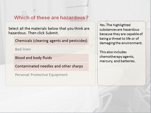
AFTER: Below, the bullet list is transformed into an interaction.

When the learner responds, content is presented in the feedback.

Step Four: Add meaningful visuals and interactions
More of our brain’s resources are devoted to processing visual information than any other sense. Using visuals to suggest, explain or illustrate can facilitate learning. Visuals add meaning, they are motivational and they provides aesthetic appeal.
In addition to photographs and illustrations, remember you can create diagrams and simple objects from PowerPoint shapes. Also, use arrows, highlights and other indicators for focus and emphasis.
BEFORE: In the example below, several safety guidelines
are listed in text and the graphic is misaligned.

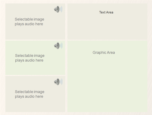
AFTER: The text is replaced with audio that plays when each
physician is selected. Not using audio? Display a speech bubble with text.

Step Five: Improve the layout
There are some basic principles of visual design that contribute to ease of visual processing, which enhances learning. Some quick tips for improving the layout are:
- Use a grid or guidelines to provide visual structure (See my article: Designing With A PowerPoint Grid)
- Align visual elements with each other
- Ensure there is enough white space around graphics and text
BEFORE: Below, important information is lost
because of a crowded screen and a non-optimal layout.
AFTER: Place important content on a quiet screen with no distractions,
as shown below. Align the visual elements in a simple structure for easy reading.

I hope these guidelines help you manage your PowerPoint makeover process. If you make high-level design decisions first, you’ll be more productive and efficient than if you work slide by slide.
Resources for Inspiration:


Thanks for catching that error, Elizabeth! I have trouble with higher mathematics. Glad you found it helpful.
Connie
Hey, i just noticed you have two “Step fives.” But i loved this! Very easy and very helpful !
Connie … thanks for the feedback. I never use white background in any presentations, eLearning, etc. that I develop – at least when I actually have control of that aspect. Give a shot at the background I suggested and see what happens … at least on a few of your slides.
If anyone wants an awakening on light font on dark background … just Google it; an interesting thing I found was that, in the eLearning world at least, dark on light is easier on the eyesight of those with astigmatism – which I and almost 50% of the population have. Further, some research indicates that dark on light enhances learning retention by 25%!
Hi Sally,
I got that from Thinkstock and then in Photoshop, removed some of the elements on the bulletin board because it was too much.
Connie
I love that bulletin board background. Did you get that from Elearning?
Hi Tom,
Love your suggestions, thank you. I agree that a photo background can become boring and should only be used for a one or two slides where you are suggesting context. Thanks for contributing.
Oh — and as far as using a light color for a background in a presentation, I think it depends on whether the room is large or not. It could work in a smaller room. All I know is I gave a presentation to a large room of professional information graphic designers with a white background and was told it shimmered when they looked at it. Never would I do that again!
Regards,
Connie
As for font … I use Tahoma, a wysiwyg, semi-serif font that is very readable online and in PPT presentations. For slide background color, I use a light yellow-beige at RGB 255 – 255 – 216, for which I have been complemented a number of times for ease on the eyes. My wife has been using the Tahoma / yellow-beige background combination for her presentations and has also been getting kudos.
Also, I find that using a textured or artistic background such as the “hospital bed” example becomes very boring and distracting after two or three slides.
But, of course, the KEY thing to remember when using PPT or whatever is that technology is not instruction!
Hi Leslie,
I get backgrounds from eLearning Art, as they have a great selection of office, hospital, pattern and textured ones. (If you purchase an annual subscription, they’ll give you an extra free month. You have to type “eLearning Coach” in the field “How did you hear about us?” They have great character photos too.)
I also get them from standard stock photo sites, just searching for “backgrounds” or “textures.”
Happy creating!
Connie
Connie
HI Connie:
Really loved the post. I’m interested in finding a source for backgrounds for slides for both Powerpoint and elearning. Can you give me some resources?
Hi Connie,
the post is very interesting and relevant to what I am doing right now. However my computer faculty says this audio clippings and the quiz kind of work is possible only by a graphic designer as it calls for java scripting and flash technology. And if I have audio clippings inserted using them as separate audio files can they be imported on line? how did you do the above work only power point ?
Cheers
Meenakshi
Hi Sharon,
Sometimes clients want to have design discussions. It’s always a good idea to present at least one look and feel prototype first, which I’m guessing you are doing. As it says in the article, I back up my decisions by talking about the learner characteristics, the organization’s mission/image and the content. I also talk about the way people perceive and process information. A simple example is that if the screens are too cluttered, learners get too many visual cues.
But I understand that design is also very subjective and sometimes your client or your internal team will just not like it. Door closed. When I do website design, I will offer my clients two or three approaches from which they can choose. Perhaps that would be the best approach in this case. Also, I’m wondering if you have had a design discussion with your client first? This way you can tell the types of things they like. If you want to get more specific, let me know. It’s hard to help you “hit the nail on the head” without knowing more.
Best,
Connie
Hi Connie, thanks for sharing some great makeover examples. I’m curious about how you share your design decisions with clients. Do your clients want to know why you chose a specific color palette, for example? I’ve been asked to share my thoughts about a PPTX that will be presented to a client, and after two approaches, I still haven’t “hit the nail on the head” with my response. I think the “right” response (if there is one) might depend on whose listening. I’d like to know your thoughts on talking about design with clients.