
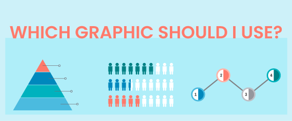
Visuals have the potential to add great meaning to a learning experience. The human brain devotes more resources to processing visual information (for sighted individuals) than to any other sense. Yet it is often difficult to know which graphics to use for eLearning. This is particularly true when the content is abstract rather than concrete. Abstract graphics can represent things we can’t see or touch from subjects as diverse as finance, soft skills, science, medicine, technology and more.
This type of content may be best represented by using abstract or nonrepresentational graphics. Here are some guidelines for transforming abstractions into a visual format. I hope you find these useful. For a related article on this topic, see Using Graphics to Improve Learning.
Are you explaining a system or entity?
If your content involves describing components of a system, organization or entity, use a schematic diagram to depict an overview of it. Many learners benefit from seeing the big picture view. It provides a framework for constructing future knowledge. In the diagram, include all the components of the system and use connecting lines to indicate relationships.

Does the system or entity have a clear hierarchy?
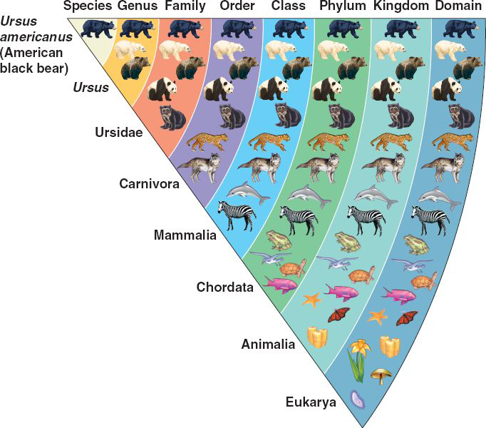
If the system has superordinate and subordinate components, it’s easy to create hierarchical eLearning graphics. Think of organizational charts and biological taxonomies. Replacing the icons with photographs is another approach. This type of abstract graphic represents the relationships between elements. Viewers interpret the elements at the top as most important.
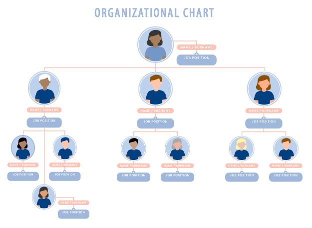
Don’t limit the type of abstract graphics you use. This chart below visualizes biological classification in a unique way.
(No copyright information available.)
Does the system or concept have a layered structure?
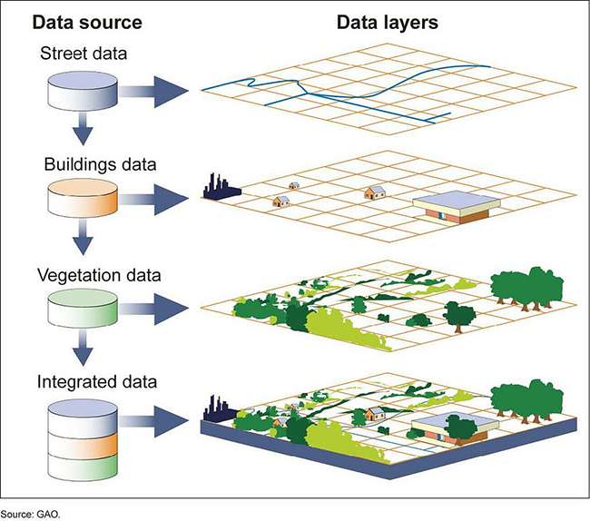
Use a layer diagram to show a high-level view of a system comprised of structures, tiers, or components that are conceptually overlaid on each other. This example from the US Government Accountability Office depicts the software architecture of a Geographical Information System. In one view and from one angle, the diagram coveys the structure, making it easier to understand than words alone.
Are you explaining a process or procedure?
If you’re unsure of which graphics to use for explaining a process or procedure, visualize each step. Show all the system components, but use arrows for connecting lines or numbers (or both). See the example for how to put out a fire below. Arrows and numbers help viewers understand the process because they indicate the correct sequence. Using icons makes this type of graphic more representational than abstract.

Are you presenting statistics?
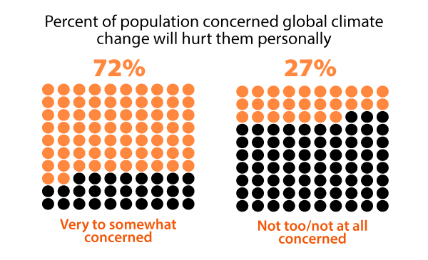
Forget the boring approach to presenting numbers as text. Try to find other non-representational graphic approaches, such as making the numbers concrete. In the example below, percentages are more interesting through the simple approach of coloring in the appropriate number of circles. This is easy to make with any graphic editor, including PowerPoint. Or you can show differences in the data by making comparisons, as in the next section. This type of abstract graphic works when it represents a number equal to 100 or less.
Are you making comparisons?
If you’re comparing quantitative information, use a bar chart with the bars in close proximity to indicate they belong to the same group. Making the bars the same color encourages viewers to make comparisons. Vertical and horizontal bar charts are one of the few graph types that people find easy to read. Thus, they are an abstract graphic of choice.
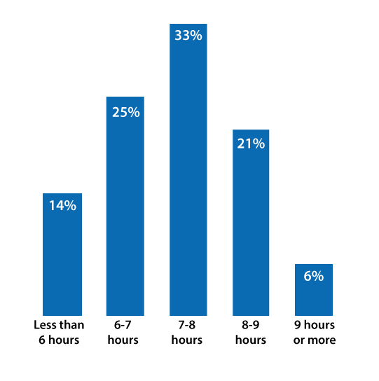
Hours of sleep that adults get in U.S. Data: NY Times
Or Try a Pictograph
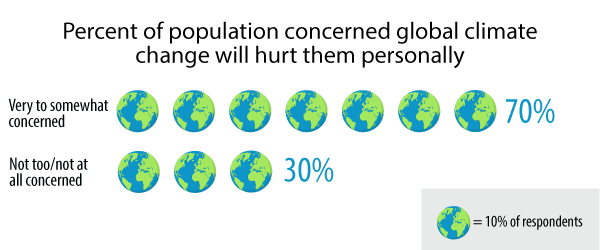
Another approach to visualization is to use a pictogram or pictograph (even called a quantagram) to represent statistical information. These abstract graphics are similar to horizontal bar charts but the data is represented with an icon. Pictographs need a key or legend because each icon represents a quantity. Although pictographs may make data visualization more attractive than bar charts, they may be more difficult to interpret quickly. To overcome this, add the numeric equivalent at the start or end of each row.
Are you pointing out specific values?
If you’ve got lots of data and you’re not sure of which type of graphic to use, consider a table. You may not think that a table is an abstract graphic. Technically it is not. Yet tables are ideal for organizing quantitative data or words into categories. When an audience needs to see specific values or when there are many data points, it’s easier to spot specific information in a table rather than a graph. If you’d like more information on table design, see my ancient article, Guidelines for Designing Tables.
Data tables may present a problem for screen readers. See Creating Accessible Tables for web pages. Also, see PowerPoint Accessibility to see how to make data tables accessible in PowerPoint, which is more difficult.
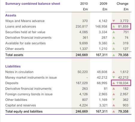
Table designed by Roger Attrill
There are an infinite number of ways to make information and statistics visually pleasing and compelling. These are just some of the ways to approach data. For a related article on this topic, see Using Graphics to Improve Learning.
Get the latest articles, resources and freebies once a month
plus a Visual Design Cheat Sheet.

Hi Connie, thanks for this ‘just in time’ learning. I am just about to embark on adapting a powerpoint into a job aid for people to access via smart phone or web. It needs to relate the information in ready to use formats, such as graphics and infographic designs, as well as video. I create online courses but this is like an online course on steroids. Less is best but also must be functional and effective. Your information on here was very helpful. Thanks Kim
Thanks for your comments. There is no agreement on the term graphic or visual or even chart. So, it’s not worth debating that. I certainly wouldn’t call a graph generated in Excel an illustration. I do agree that the desired data interpretation should influence the choice of graphic. Thank you for that contribution. Since this website focuses on how people learn, in this article I was interested in tying cognitive strategies to the choice of graphics.
Merci pour ces précieux conseils qui permettront de donner plus de pertinence à nos graphiques
Of course I mean rules for illustrations 🙂
I like your blog very much and your book Map iT! is very handy, but..
You better change the title into: “which illustration should I use”.
1. The first five examples are not graphics.
2. Choosing the right graphic should focus on which data intepretation you wish to show: See for example here: https://towardsdatascience.com/data-visualization-101-how-to-choose-a-chart-type-9b8830e558d6
3. for the first five examples: explain the Clarke/Meyer rules for graphics
This is very helpful! Thanks for your untiring efforts! God bless.
Rose!
Nice examples and good explanations of when to use
If you are talking about visual impairments, then provide two approaches. The data in a text format and the graphic. Also, don’t use color alone to distinguish between values.
I personally prefer to learn through text, so it can be difficult for me to imagine how to convey information visually. Your categories and examples are very helpful!
I was wondering though if you could also provide advice on how to factor in accessibility when designing graphics like these.