

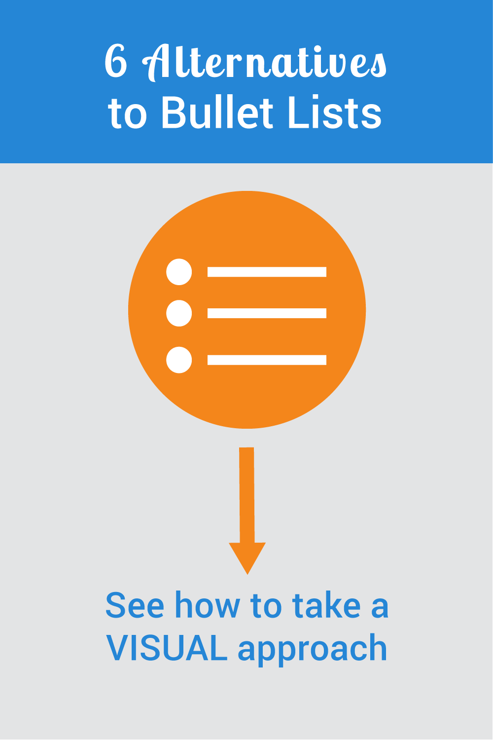
Bullet points make a sequence of important ideas easy to read. When those near-perfect little circles are vertically aligned, readers can quickly process the text. Yet too many bullet points in an eLearning course or slide presentation can be repetitious and mind-numbing. That’s why you need bullet point alternatives to mix things up.
Learners and audiences need novelty to maintain and sustain attention. The trick for going beyond bullet points is to think visually. By sprinkling in bullet point alternatives here and there, your minimal use of bullets will be more effective.
Here are six bullet point alternatives you can create in any graphics program or in PowerPoint. If you’re interested in more visual design ideas, see my book, Visual Design Solutions.
Bullet Point Alternative 1: Use text boxes
A simple alternative to a list is to place each item into a a text box that is arranged in a suitable layout. With this approach, each point is more pronounced than in a list. It can also be accomplished easily with basic graphic tools and in PowerPoint. Below, what could have been a bullet list of eLearning design skills is placed in horizontally arranged text boxes with a 1 pixel border.

Bullet Point Alternative 2: Use icons to indicate the topic
Using the same text box idea as above, this approach adds icons to the mix. Not only does this add visual appeal, but it suggests what the topic is about. An image may also work as a mnemonic device to help a person retain information. If you need help finding suitable icons, see How to Use Icons in eLearning for more on this topic.
![]()
Here is a similar idea using long horizontal boxes. The text is longer than a phrase, but this could work with a shorter statement.

Bullet Point Alternative 3: Let People Speak Your List
If your learning design includes scenarios, you can use the characters to speak your bullets as shown below. This can work well as a summary of key points. When you use people cutouts to speak your points, no one will suspect this is a bullet list.

Bullet Point Alternative 4: Wrap the list around a muted picture
Another simple approach is to find a relevant silhouette or cutout of a person or object. Then wrap the bullet list around the silhouette or shape, gently following its contours. I prefer to use silhouettes when I want the text to be prominent. Silhouettes are a subtle way to add visual appeal without being too obtrusive.

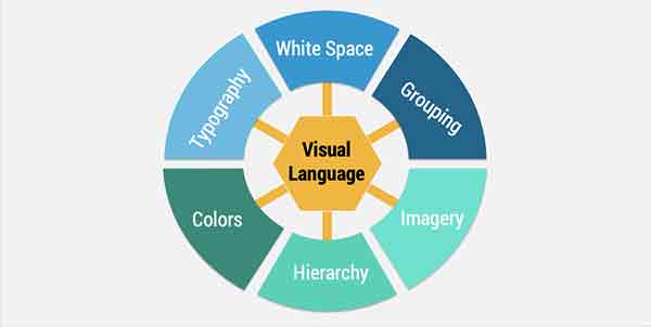
Bullet Point Alternative 5: Draw a Diagram
Then there’s the diagram approach. Use a radial diagram when information is at the same level. Place the topic or category in a circle or ellipse in the center. Then place spokes around this shape in the form of arrows or pointers. Place what would have been a bullet list item at the end of each spoke.
For alternatives to the radial design, consider a hierarchical chart when there are key points and sub-points. Also experiment with PowerPoint’s predefined diagrams. Just remember to use grouping principles so learners will know which items are related to each other.
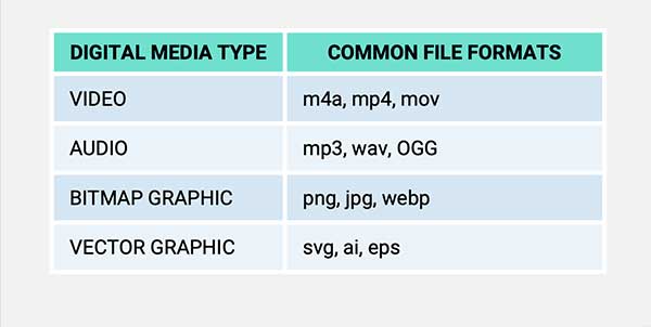
Bullet Point Alternative 6: Create a Table
If you analyze your content carefully, you might find that several bullet lists can be associated into one category. If so, you may be able to transform your bullet list into a table. The wondrous thing about a table format is that the values can be either words or numbers. In the media format example below, different multimedia file formats (on the right) are organized into a table by media type (on the left). This was able to replace four separate bullet lists.
Get the latest articles, resources and freebies once a month
plus a Visual Design Cheat Sheet.

You’ve got some great ideas and I think they can work given the right context. The approaches in this article work for eLearning and many presentations, but his ideas would mostly work only for presentations. Spreading related points across multiple slides will often NOT work for eLearning but would be fine for a presentation. Also, much depends on the purpose of the presentation. If it’s to raise funds for a charity or to get volunteers, it might be completely different than if the the slides are for training on how to save a patient’s life or explaining scientific research. In some cases, the goal is to raise awareness and in others it’s for learning transfer.
Thank you for this post, Connie!
I’m new to your blog and so far have found it very insightful!
You suggested some great ideas as alternatives to using bullets. A list of bullets might have worked in the past, but nowadays, you loose people’s attention in a matter of milliseconds, so the content has to be to-the-point and visually captivating.
I was reading a post by Dirk Haun (https://www.themobilepresenter.com/article.php/bullet-points) and he suggests we use one idea per slide. He questions why presenters insist on cramming so much information in one slide if slides are free! He goes on to suggest using photos or visuals that emphasize the point you’re trying to make.
Ned Potter also offered some interesting ideas on alternatives for bullet points (https://www.ned-potter.com/blog/6-alternatives-to-bullet-points). He mentioned some pretty persuasive reasons he found on the International Journal of Business Communication (2015), saying that “your audience engages less, remembers less, agrees less and likes you less when you use bullet points in your PowerPoint presentations.” Some of his ideas are similar to what you shared, but there are some different ones… worthy checking:)
I kinda like the suggestion of using one idea per slide, but I’m just afraid people could loose the sense of grouping the information under one big umbrella or topic.
My suggestion would be to introduce the main topic using one of your visual ideas with the “bullets” in the form of text boxes, icons, diagrams, or even a list wrapped around a picture, then present each idea in a separate slide with a short message and a picture, graphic, or visual that really captures the main idea, and at the end wrap up that point by sharing the first slide again and briefly reviewing the points that were touched. This way I feel that the audience would get a better sense of the categories under each main idea.
Fabulous ideas for more creative bullet points. You must be a professional!
Thank you for the ideas.
Yes, that’s a good approach. Glad you are sharing it.
Another top post, Connie. I’m relatively new to your site, and just catching up on “arrears” of your great ideas!
Like Craig Hadden, I favour displaying one item at a time in presentations and webinars – using “build ups”.
The easiest way to make this look seamless is to create the final slide in the series first – and then copy this as many times as necessary and delete text boxes from the earlier ones in the series as necessary.
So: create slide 6 with 6 text boxes and copy it so you have 6 copies. Then delete text boxes 2 to 5 from slide 1 (leaving box 1) – delete text boxes 3 to 5 from slide 2 (leaving boxes 1 and 2) – and so on until you build up to slide 6.
I find this works really well if I “highlight” the current point being discussed by the narrator. Usually, I keep the relevant text box in full colour, and fade the previous text boxes using transparencies.
Keep up the good work!
Thank you. Very useful.
I will be integrating this idea into my educational technology class at UVA Wise in the spring. Thank you
You’re welcome, Shalini 🙂
Great alternatives to the dreaded bullet list! Thanks for this insightful article and highly effective tips.
Nicely done. More creative and visually attractive which is what we need.
Maybe five? People can process around 3-5 chunks of information at one time.
Best,
Connie
I am a pastor and am trying to communicate more than 10 characteristics of God. I can just see the eyes glaze over. I imagined a graphic of some kind being a better approach than a list as long as your arm. I like the graphic you suggested above. How many satellite points can I use before they miss everything?
Thanks, Aaron. Hope you enjoy the podcast.
These are awesome ideas. Thanks for sharing. I just found out recently you are doing a podcast. I been going through and listening to all of them. Great Stuff!
Aaron
Thanks for the kind words, Belen. Glad it helps!
Connie
Always a reference for me to get rid of bullets.
Thanks!
Belen Casado
Thanks for the excellent suggestion, Edward. This would work well with a professional narrator and with captions too.
Use a blank slide (‘B’ ow ‘W’) and use your own voice, visibly counting on your fingers each point you make.
Hi Connie,
I enjoyed reading your article, especially Alternative 3: Let People Speak Your List. While I have utilized the other techniques in my own PowerPoint presentations, this will be a useful addition to my slides.
Thanks!
Hi Craig,
Thanks for all of your ideas and links. I love when readers share what they know. What a great community.
Best regards,
Connie
Great post, Connie! This list is really accessible and useful because you’ve illustrated each idea and described them succinctly, yet also supplied links to more resources.
As for which alternative is best, I enjoy using icons (or even iconic photos), people and diagrams to replace bullet lists. (And to make diagrams, SmartArt’s a great help – you can even right-click a bullet list and choose Convert To SmartArt.)
To see what I mean by iconic photos, see this post: http://remotepossibilities.wordpress.com/2011/11/16/5-ways-to-be-a-top-presenter/#whats_in
And a good use for a “list” of people is to create an audience-oriented agenda: http://remotepossibilities.wordpress.com/2011/12/01/intrigue-people-firstframework-part-1i/#structure_picture
Displaying a list of items one at a time works well, and you can do that with all 6 alternatives. That way, the audience is intrigued about what’s coming next. I blogged about that process (with illustrations) here: http://remotepossibilities.wordpress.com/2011/12/01/intrigue-people-firstframework-part-1i/#show_cues
Coming from a tech-writing background myself, I find tables really valuable, too, which might explain why I use them quite a lot in my posts!
Anyway, thanks for all the neat ideas here.
I’m glad you found it helpful, Tash. I’d love to hear other suggestions. I’m sure there could be many more.
Connie
What a great list of alternatives, Connie – thank you. I knew or could name all of thsoe but hadn’t really thought about using them more than bullet lists when I help clients with presentations. I do use tables a lot as well as lists with an image but you’ve reminded me to mix things up further.
Very nice article, useful, succinct, to the point. Thanks for sharing!
Hi Michaela,
Thanks for your support. It’s not always easy to get around using bullet points, but it’s good to try (unless they are really needed).
Best,
Connie
Connie,
great article! I wish all the people read it and stop using bullets all the time..
I am glad to see your article as one of my readings in my EdTech course.
Michaela
Just saw this post via Scoop.it. Great ideas, thanks!
I think it’s a good idea to mix things up, remembering what Chantelle (8/5/11 post) said, “need to make sure the graphic doesn’t pull away from or interfere with either the relevance of meaning of the information being presented.”
Also, bullets help to organize the information in a way the alternatives can’t do quite as well. Mixing it up keeps the participant “awake”…using styles appropriately helps them to retain the content. TX for the good ideas!
Such simple yet innovative and amazing tips….thank you. These will really bring substantial improvement to my presentations.
I love these ideas and have used a few of them in my own design. However, I think we also should remember what I just learned in a statistics class, which is that you need to make sure the graphic doesn’t pull away from or interfere with either the relevance of meaning of the information being presented. For example, I love infographics, but if you look at some of them, the ratio of the pictures they use to display the information isn’t the least bit accurate. Obviously, it’s probably easier to confuse numerical data than it is when trying to simply display words to be interpreted, but still, at times a graphic might be interpreted to mean something with regard to the content that it is not meant to, so it’s good to keep that in mind.
I just discovered your blog via School Library Media Activities Monthly. You have blown up my PPT presentations in my middle school library! I’m not a very creative person, so your suggestions made me see how dynamic a PPT can be.
I can’t wait to share these ideas with our 8th grade students, who do about 4 PPTs a year in history class. Their presentations fall into two camps–dry bullet pointed lists of information, or chaotic slides crammed with every transition and animation PowerPoint offers. Our teachers will be thanking you, too, as they wade through 150 PPTs each quarter.
I’m glad I am back at work 2 weeks before the students so I can work my way through your blog and website to educate myself on design! Thanks for sharing your insights.
I really like #4, which supports a list with items that contain more than a few words. I’ll try it out.
Thanks!!
Thanks for posting! These look great, were very inspirational and got me thinking of more ways to do this!
Very good ideas. I usually use the nos 1, 2 and 5 ideas. Will now look for an opportunity to apply others. Bullet lists are quite cliched now-a-days, but at times, we can’t simply do away with them. This will help.
Great article – creative alternatives – love it!
Excellent idea! Will share with all Trainers in Indonesia. Thank you!
Fantastic information and ideas – thank you!!
I agree, Jose. Icons can be leveraged so that they facilitate learning. Thanks for your comment.
Connie:
I like your ideas. Specifically, I like the “Let the icons do the talking” since it takes advantage of the metacognitive study strategies of mnemonics and visual imagery.
Please keep bringing the good ideas, thanks for an excellent coaching.
Nice video, Bruce. Thanks.
This is a great set of options!
Here’s a video showing how to create your own set of icons so they look good together.
http://speakingppt.com/2011/02/16/tip1-icons/
—
Bruce Gabrielle
Author, Speaking PowerPoint
Thanks, Mark. So happy this is helpful. Teachers need all the help they can get.
Best,
Connie
Really like this post. As a teacher in school it is important to keep content fresh and engaging, and moving away from dry bullet points is a fast, easy and practical way to do that.
Thanks. Really like the way you worded your comment. 🙂
Really like the way you work around the dreaded list.
Hi Anne-Laure,
Thanks for your comment. I’m sure it’s quite satisfying for you to improve your SMEs’ presentations. I’m guessing that their use of the word “NICE” means a lot more than that. It’s just a simple way to express the richness that you’re adding. 🙂 Keep up the good work!
Best,
Connie
Hi Scotty,
What a great metaphor for information design–when food looks better, it tastes better. If you’re interested in information design, you may want to read these articles:
– We Design Information Too
– The Information Design Handbook: Book Review
– Designing Text-based Information
Thanks for your comment.
Connie
This is a great message, reminded me to focus on the design of information. When food looks better, it tastes better, the same is true for information. My favorite use of this is the web 2.0 stick people… thanks for sharing
I am currently coaching SMEs in rewriting their marketing presentations into “elearning” material (as far as we can do with only PPT) so I show them like you do what alternatives can be much more engaging than dry bullet points (with endless sentences!) and no pictures. My only concern at the moment is that their comments after the work is done is “this is so NICE now”. I assume this means more engaging and will do the job…
I will keep your examples also and put it in my best practices if you don’t mind (with mentioning you of course!). It will add credit to my speech if there is some English experts saying what i repeat every single day.
Thanks for your always “just in time” posts.
Thanks, Bruce. Glad this helps. I still use bullets myself, but try to mix it up with these types of approaches.
Nice article.
I have been trying to “ban the bullets” with clients recently, this is a nice set of alternatives – all simple and easy to explain.
Nice one.
Bruce