
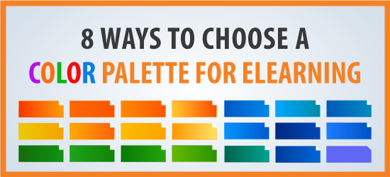
One of the most frustrating aspects of learning design is choosing a color palette for eLearning. The color palette refers to the limited and predefined set of colors you use in a design.
If we only had 100 color choices, choosing a palette might not be a problem. But we have access to millions of colors, which makes the possible choices overwhelming. Out of this seemingly infinite range of colors, how can you possibly narrow down the list and decide which ones to use?
Goals for Your eLearning Color Palette
For starters, there are at least five things you will want to get from a color scheme. Your color palette should:
- provide sufficient color contrast to make instruction accessible to all,
- promote a positive experience,
- avoid causing eye fatigue,
- project the appropriate mood or psychological effect for learning, and
- be appropriate for the audience and content.
Quick Tips Before You Start
- Accessibility. Validate the accessibility of your palette prior to implementation. Use a color contrast checker to meet the latest WCAG standards, such as the ACPA Contrast Checker.
- Neutral to Start. Consider starting a design with shapes in a neutral palette, such as with shades and tints of gray or brown. Then begin to slowly add color where it is needed.
- Color Context. Consider the effect of adjoining and background colors. We perceive colors based on adjacent colors.
- Number of Colors. Creating a palette is easier when you have a small number of colors. Consider a palette of 3-5 colors: one or two main colors, a neutral and an accent.
- Consistency. Try to be consistent with your palette. For example, when possible, use the same color for all highlights. Use the same color for all arrows.
- Color and Learning. Understand the qualities of color and how they affect learning. Learn more about color in instructional design.
With these guidelines and tips in mind, here are eight ways you can go about choosing a color palette for eLearning and other learning materials. One or more of these approaches should work for every project. Try choosing two to three key colors and one or two accent colors. Also select a neutral or pale color for the background or other uses. Dark text on a light background is the easiest to read online. After finalizing your palette, add it to your visual style guide.
Color and Accessibility
How can you ensure your palette will promote learning for those with color blindness and visual disabilities? Avoid using color alone to convey information in graphics and text. For example, rather than using blue text alone for links, add an underline to all links. In an information graphic do not use color alone to convey information. Add an icon, pattern or similar device to represent the information.
In addition, follow WCAG guidelines for color contrast between text and the background. Learn more about designing for visual disabilities at WebAIM.
Strategies for Choosing a Color Palette
1. Base your palette on organizational branding
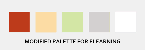
You may have little choice in a color scheme if you are required to use the branding colors of your organization or that of your client. As you know, branding colors are selected to convey a particular message. The leadership may be hesitant to stray from this color identity. If you find the colors distasteful or inappropriate for learning materials, perhaps you can present a case demonstrating how learning content has different requirements than marketing content. Although there is some overlap in the goals of design for training and the goals for marketing, training has a focus on long-term retention and improved workplace performance. It’s important that learners focus on the right parts of an image and that the design doesn’t cause eye fatigue. Gaining attention — a key goal of marketing — is only one aspect of a training course.
Perhaps you can modify the palette you were given by softening the colors and replacing a few with neutrals. For example, in the first palette shown below, you may find the color combinations a bit harsh for a training course. The modified palette, shown in the second version, softens two colors and replaces two with neutrals.

2. Base your palette on the audience and content
Use your knowledge of the audience to choose a color palette. If the course is for preschool teachers and assistants, it might be appropriate to use a palette that includes bright primary colors. These colors are associated with young children. You can avoid overwhelming the audience by balancing the color scheme with neutral colors and limiting the areas where you use vivid colors. On the other hand, if the materials are for employees of a conservative financial institution, you would choose a muted palette.
3. Base your palette on the color scheme of photos
Perhaps you have a set of photographs that will make up the bulk of your content, such as images of warehouse employees. In that case, you can choose your eLearning color palette based on the key colors in your photos. For example, in the photo below, the color palette for an eLearning course might contain a shade or tint of blue from the work clothes, yellow from the hard hat, orange from the safety vest and a neutral tan pulled from the boxes.To get the exact color, use a graphic program or utility color picker to select the colors from a photo.
You can also automate the process by uploading photos to an online palette generator, which will then create a palette based on your photo. I’m not sure I like it though, in which case, I would change a color or two.

4. Base your palette on its psychological impact
Consider choosing a palette for the psychological effect you would like to have on the audience. Vivid and bright colors excite. So do the warm colors of red, orange and yellow. Muted colors are relaxing. So are the cool colors like blue and green. Use colors that are attuned to their impact on the audience. If you are creating materials about caring for people with a serious illness, then you would need to show sensitivity in your palette. A bright and cheery color scheme would be misplaced. In this case, a palette of soft pastels might be the best choice.
5. Base your palette on symbolism
Colors are associated with meanings that vary by culture. If symbolic color has emotional relevance to your audience, consider selecting colors that will add meaning to the learning materials. An obvious example would be to take advantage of the symbolism of traffic light colors when designing a safety course for laboratory technicians. Using green for safe procedures and red for those that are unsafe would be one way to approach the palette.
6. Base your palette on conventional industry colors
Some industries use a conventional color palette that you may want to adopt because it will feel familiar and comfortable to the audience. For example, the healthcare and finance industries often use a blue palette, political organizations often use the colors of their country flag, and environmental organizations often use greens and blues. See the logos below.

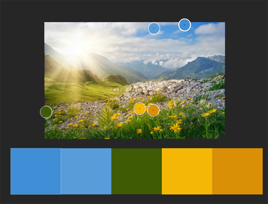
7. Base your palette on nature’s color harmonies
You can almost never go wrong by using nature as your inspiration for a color palette. People typically find the colors in a flowery meadow or the hues of the sky, ocean and sand aesthetically appealing. We tend to find nature’s color palette harmonious. If you’re not sure which colors to pick for a palette, look to the colors in the natural environment for inspiration. Then modify the palette as needed.
Below is a palette generated from a photograph of a mountain scene for an eLearning color palette, using Adobe Color palette generator.
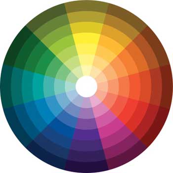
8. Base your palette on color theory using a color wheel or palette generator
A color wheel provides a framework for understanding color theory and for selecting a color scheme. The diagrammatic representation of colors in a wheel makes it easy to select a palette based on formal rules of color harmony. A few color schemes based on color theory, using the color wheel as a frame of reference are:
- Analogous Color Palette: color scheme created from colors that are adjacent to each other in the color wheel, like green-yellow green-yellow
- Complementary Color Palette: color scheme created from two colors that are across from each other on the color wheel, like blue and orange
- Monochromatic Color Palette: color scheme that uses variations of only one color, like shades and tints of blue
There are many palette generators you can use to create palettes based on these and other color harmonies. Here are a few color palette generators:
One More Note
Ideally, when you choose a color palette for eLearning and slides, you will stick with it to provide a consistent and professional look. Although you may need to modify a color selection here or there, it’s best to identify the palette at the start of a design as you get a sense for how things will look and fee. Then work within your chosen color scheme for the rest of the project.
To learn more, check out my book that teaches visual design to learning professionals, covering principles and creative inspiration.
Get the latest articles, resources and freebies once a month plus a Visual Design Checklist.

I am in the middle of coming out with an e-Learning website for below 12 years old children. Therefore, this article helped a lot for selecting the correct colors to make the site interesting and attractive. So many tips to learn from.
Thanks so much for sharing.
Thank you for this guide for choosing colors for eLearning. I found that I tried to incorporate many of your suggestions via trial and error over the past year of delivering lots of online workshops, without reflecting why i made the choices I did. Your suggestion to start with neutrals is particularly helpful. It can be jarring to view modules and presentations with too many pops of color and saturation that detract from the material presented. Great article!