
The most efficient way to achieve consistency in the visual design of eLearning and presentation slides is to create a visual style guide. A style guide provides one graphical standard for the people and the project. It’s nearly a necessity when working on a team. It’s also valuable when working alone, because it’s difficult to be consistent in your design without a reference document.
In addition, learning designers are often pulled off of one project, placed on another higher priority one, and may return to the original project months later. This makes it difficult to remember the design choices you made.
Advantages of a Visual Style Guide for eLearning
It takes effort to make and document design decisions, but there are many benefits to writing an eLearning visual style guide.
- Forces you to make up-front design decisions.
- Encourages you to consider accessibility during design.
- Provides one visual standard for an entire course, curriculum or organization
- Saves time when you need to look up colors, font sizes, etc. Learn more about the characteristics of color and choosing a color palette. Also see How to Choose a Font for eLearning.
- Having documentation improves efficiency
- Provides the styles for future courses if you want to re-use the design
- Provides a way to get buy-in from your client
- Looks professional (clients are usually impressed)
A visual style guide can evolve. If you choose to or need to change a design decision, just update the product and your document as well.
How to Get Started With a Style Guide
A visual style guide doesn’t need to exist in a vacuum. You may base it on previous work, on branding guidelines or on an organization’s website. If you’re starting from scratch and need ideas, check out designer portfolios that you can find at sites like Dribble and Behance. Also, see 21 Ways to Get Visual Ideas.
How I Get Started
My technique is to start with a title or cover slide (that’s the first one). I often sketch a few thumbnail ideas first. After much experimentation, I may hit on a few ideas I like. I’ll then begin to implement these ideas in a graphic program. You can also use PowerPoint or an authoring tool.
This “play” stage can take awhile. I think about meeting the needs of the audience, the content and their work environment. “Who are these learners and how will they feel about this design?”
I try different colors, shapes and fonts. When I think I’m ready to move forward, I document the palette and the fonts that I chose. I will often use one type of shape throughout and document that also. This will be the start of the visual style guide.
What to Include in a Visual Style Guide
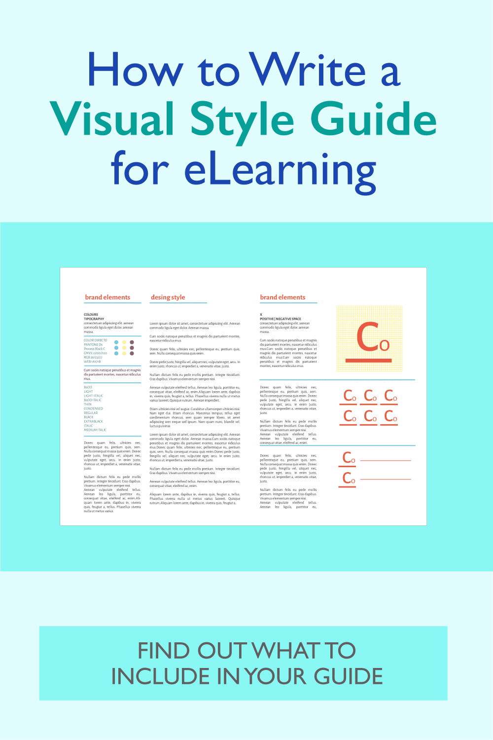
Here are my recommendations for the standards you may want to include in your guide. When possible, include visual examples of the styles to ensure everyone understands. This guide doesn’t tell you how to make design decisions, just which decisions to make and specify.
Do you have additional recommendations? Please add them below in Comments.
| Visual Element | What to Specify |
|---|---|
| SCREEN LAYOUT | Identify all template designs you will use, such as a layout for embedded video or one for scenario interactions. Use text and visuals to explain the layout, showing mock-ups or screen shots. |
| COLOR PALETTE* | Show the full color palette in solid circles or squares. Beneath each shape, include the hex code of the color (that's the 6 digit alphanumeric code, such as #ffffff for white). Ensure there is sufficient contrast between colors to meet accessibility guidelines. |
| Main Colors: identify two or three for the overall interface and background. Choose colors that are easy on the eyes. Often a neutral color for a background is best. | |
| Patterns: identify the patterns you will use in additional to color-coding for those with color vision deficiency. | |
| Accent Colors: select one or two accent colors that contrast with the main colors. | |
| Hyperlinks: specify the color of hyperlinks. | |
| ACCESSIBILITY | Specify the standards and level you will adhere to for accessibility of your visual design. See Color and Typography in this guide. |
| TYPOGRAPHY | Contrast between text and background: Identify the contrast ratio you will use to provide sufficient contrast between foreground text and its background. |
| Font size: Identify the appropriate size of fonts needed to meet accessibility standards for each item below. | |
| **Display type, often used for titles: specify font, style, color, size and justification | |
| Subtitles for heading text that is larger than body text: specify font, style, color, size and justification | |
| Body Text: font, style, color and size (will typically be left-justified for readability) | |
| Captions; font, style, color and size | |
| Labels: font, style, color and size (this may need to vary) | |
| READABILITY | Line-spacing: identify how much space to allow between lines of text within a paragraph |
| Paragraph Spacing: identify how much space to allow before and after paragraphs | |
| VISUALS | Image Style: identify types of images to use, such as color photos, black and white photos, illustrations or clip art |
| Image Sizes: specify standard sizes of images for each type of screen (example: split screen photos will be 512x768) | |
| Image Borders: identify whether images will have borders and the color and line thickness of the border | |
| LOGO | Note which style of logo to use on the title screen (you won't be using it on other screens, right?) |
| VISUAL CUES | Type of visual cue to direct the eyes or create emphasis: arrows (show example of head and stem), hand-drawn circles, light band of color, etc. If using multiple highlights, specify when each type will be used. |
| Color, shape and size of visual cues | |
| INTERFACE ELEMENTS | Identify the color and style of any user interface elements you control, including button style, menu style and navigation elements. |
| Buttons: shape, size, color, typographic features of text; flat design or shadow, button states (up, down, disabled, etc.) | |
| Icons: style (outline, colored, flat, shadow, details) and size of icons for navigation or other UI purposes | |
| Menus: size, shape, color, typography of menu options. Responsive menu styles. |
Notes that refer to the table:
*When specifying color values, use RGB (example: 122 127 130 for medium gray) or hex format (#7A7F82 for medium gray). You can get these values in graphic programs, PowerPoint and authoring tools.
**All screens do not need titles and titles do not need to be at the top of the screen.
RESOURCE:
A Designer’s Guide to Documenting Accessibility & User Interactions
Get the latest articles, resources and freebies once a month
plus a Visual Design Cheat Sheet.

I also like that book.
One of the best resources I found when starting out was The Non-Designers Design Book. It was excellent in understanding layout, information design and many other elements.
This article is very useful when it comes to designing with purpose!