Do you get a wild variety of responses when you ask, “What font should I use for eLearning?” That’s because if depends on many factors. This article explains what to consider and how to choose a font for eLearning. But let’s clear one thing up at first. If you’ve been to a few graphic design sites, you may see they refer to fonts as typefaces.
A typeface is the family of letters and characters that have a consistent visual design, such as Arial or Helvetica or Garamond. Every typeface has a set of fonts, which are the specific point size and style, such as Arial 20 point bold or Garamond 18 point italic. But since the advent of digital publishing, the terms typeface and font are often used interchangeably. But now that you know the difference, just think of how many people you can impress.
Font Categories
With all of the possibilities, how can you choose a font for eLearning? To start, think in terms of typeface categories. Typefaces are organized into categories, according to their physical characteristics and historical context. Although there are many typeface categories, I think the key ones for instructional designers to know are listed below.
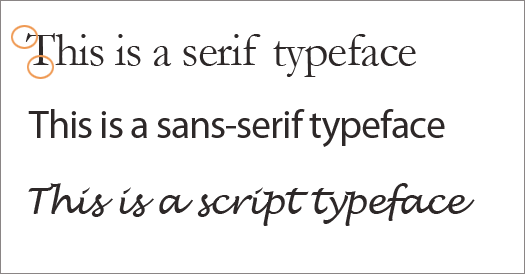
- Serif: Characters with a small feet at the end of the horizontal and vertical strokes. Examples you may know include Times New Roman, Garamond and Baskerville. The serif typeface can express sophistication, reserve, formality or tradition.
- San-serif: Characters without small feet at the end of the horizontal and vertical strokes. Examples you may know include Helvetica, Calibri, Arial and Verdana. Sans-serif fonts can (but not always) have a modern sensibility. They tend to be less formal and at times, casual.
- Script: Characters reflect the flow of lines created in handwritten letters. A perhaps overused example is Lobster. Script fonts range from an elegant calligraphic look that designers use in wedding invitations to an uneven look of handwriting.
See one typeface from each category below. (The serifs are circled.)
Consider Personality When Choosing a Font
Research demonstrates that non-designers are aware of the personality of a typeface even when they don’t consciously think about it. In one study, participants consistently matched a typeface with an adjective, such as cheap, cold, confident, dignified, playful and professional. (See: The Personality of Type for more on this).
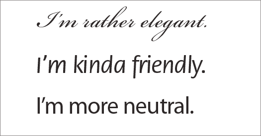
Your first consideration, therefore, is what personality do you want your typeface to express? As with selecting any visual theme, your choice should be consistent with the content, tone and characteristics of the audience. You can also go with a neutral type of font, that doesn’t have much personality at all. Start to examine typefaces more closely and see what each one expresses. See below.

Should you use more than one font type?
Many experts suggest that it’s best to use one well-respected typeface that has a full character set and an array of styles. For example, Gills Sans has , such as Roman (regular), Bold and Italic. Some also have variants, such as condensed (a narrow version) and black (very heavy). If you use one type family, you then make a consistent role for each style and never waiver from your rules. For example, you can get many different styles from one typeface by just varying color, weight and size.

In unofficial surveys, typefaces that have good reputations among web designers that could potentially work for online learning include: Avenir, Baskerville, Caslon, Franklin Gothic, Futura, Gill Sans, Lucida Sans, Myriad, Palatino and Univers. Georgia and Verdana were specifically designed to be read on the computer screen, whereas most typefaces were and still are designed for print.
Check Typeface after Compression
Before you make a final selection, see how well the typeface looks after it gets compressed for online delivery. Sometimes the results are disappointing. If the text is not as readable as you’d like, you’ll have to try again.
Add Font Choices to Your Visual Style Guide
Even if you are working with only one font, it can be difficult to remember the style and size you select for every use, such as titles, headings, body text and captions. It also slows you down if you have to search through your work to see what you previously decided. For efficiency and consistency then, add your font choices to a visual style guide that you use for your current project. See How to Write a Visual Style Guide for eLearning.
Get the latest articles, resources and freebies once a month
plus a Visual Design Cheat Sheet.


Thanks for informing us about this study, Sue, though I doubt it will end the debate!
At a conference a while ago, in a lecture on fonts, the speaker said that the original studies that indicated
serif fonts were easier to read in print because of the feet, were flawed. The reason given was that those studies did not correct for familiarity. (People were used to seeing serif fonts in newspapers and books.) When they corrected the studies for familiarity, there was NO statistical difference readability in print.
This seems to indicate that that a San Serif is a good choice in print or web.
I think combining Serif and Sans Serif can work for things like PPT, Slideshare. Serif reading online’s a little different from books, take blogs for example. I really appreciate this article and the ensuring discussion and have taken liberty of sharing on LinkedIn groups. Thanks Connie!
Hi Irene,
Thanks so much for finding this link. Although the research is somewhat dated and people are much more computer literate now, our ability to perceive and discern letter forms probably hasn’t changed. I think the research still stands except for font size. Because resolutions are much higher now and also due to design trends, readers are used to larger point sizes. Thanks for your contribution.
Connie
In answer to Laura’s question, this link is old, but it is the only research-based article that I found on this subject – http://www.wilsonweb.com/wmt6/html-email-fonts.htm
Thanks for checking, Bryce! I know they say that the little feet on serif fonts help guide the eyes from one word to the next, at least in print. What they say about sans-serif, especially on low res screens or poor monitors makes sense. Also, Garr Reynolds of Presentation Zen suggests using sans-serif on presentation slides because the poor quality of many projectors makes it impossible to see the serifs. Personally, I find all of this fascinating so it’s nice to discuss with you 🙂
I apologize, my history may be off on typography.
I do know that sans-serif fonts are considered optimal for web based type, according to design best-practices. As you had mentioned, though, there will always be debate.
As much as I hate to reference wikipedia, you can look at their definition of serif fonts.
http://en.wikipedia.org/wiki/Serif
In the last introduction paragraph they offer a few answers;
“Numerous studies have been done on the readability of serif vs. sans serif typefaces. Studies indicate that serif typefaces may be more readable in print. Studies of on-screen use are more ambiguous, suggesting that low screen resolutions make serifs more difficult to discern, with a resulting erosion of readability compared to sans serif fonts.”
So while there hasn’t been the same studies between each of the typefaces, what studies have been done suggest that sans-serif is a reasonable choice, especially when viewed at lower screen resolutions.
Laura,
I’m sorry but I haven’t seen the answer to your question. I’ll try to research it and see what I can find out when I get a chance. I’m guessing that there will be disagreements and also that it will be so dependent on point size, color contrast and spacing. I do think the topics of legibility and readability are quite important and plan to write about them at some point. Maybe a reader will be able to point us to some solid research.
Best,
Connie
Hi Bryce,
Yes, this subject is so deep, I’d like to write a lot more, particularly about combining two typefaces. Thanks for your comments. However, many sans-serif fonts were designed hundreds of years ago so you can’t really say they were designed for the web, though Verdana was. And Georgia, a serif font was designed for the web. Perhaps you are thinking that sans-serif fonts are easier to read on the web? I think so, but not everyone agrees.
Best,
Connie
I’m curious to know what research supports as being an easy-to-read font onscreen.
There are a number of guidelines you might also consider adding to this list.
First, Serif fonts are used predominantly in print media, where sans-serif fonts were designed for the web, as they are easier to read on a screen.
Second, You could see multiple typefaces in designs. Usually 2 typefaces can be within a small area without appearing out of place, but 3 or more typefaces makes a design appear cluttered.
For screen viewers, you could arrange your headings using a serif font, such as times or georgia, and you could use sans-serif fonts like arial and helvetica for the majority of body content.