How do you react when you see a very complex diagram or a screen of dense text? Are you motivated to work through it? Or do you groan and turn away if it becomes too difficult? Complex or dense displays lack visual clarity. This tends to detract from learning and in general, from a user experience.
Designing with Clarity
Visual clarity is “the measure of how effectively visual design prioritizes and conveys information,” (Dimitrou, 2020). The visual clarity of a screen or page is a result of the graphics, text, white space and layout that you use. The combination and arrangement of these elements affect how well the audience will process the information.
Processing Fluency
If you’re like most people, you’ll experience negative feelings when you come across information that looks obtuse. You’ll think the content isn’t valuable or worth your effort. It’s all related to processing fluency, which refers to the ease with which a person processes information.
The visual clarity of your content affects processing fluency. It impacts how easy the materials are to use and comprehend. Much fascinating research has been done to better understand the effects of processing fluency, which should be of great interest to learning experience designers.
Is it easy to process?
Research shows that processing fluency has a strong impact on the outcome of the processing (Wanke & Hansen, 2015). Fluency affects a person’s judgment and decision making. This is true for all mediums: screens on a device, magazine articles or a page in a textbook. In other words, people have positive feelings about visuals and verbiage when they are easy to perceive and process. Furthermore, people are more likely to experience aesthetic pleasure from something when processing is easy.
This has strong implications for learning, because of the impact positive or negative feelings have on motivation, comprehension and retention. Here are a few insightful examples from the research. Then draw your own conclusions.
Easy to Read, Easy to Do
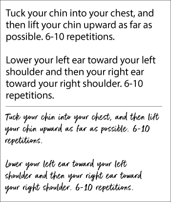
 Want to learn a new exercise? Read the instructions on the right. Does the exercise at the top seem easy to follow? And does the exercise at the bottom seem difficult to do?
When study participants were given these easy-to-read instructions at the top, they thought the exercise wouldn’t take much effort and that they could fit it into their schedule.
When the exact same instructions were displayed in a typeface that was difficult to read (shown at the bottom), participants thought the exercise would be difficult to perform and would take almost twice as long to get through. (Song and Schwarz, 2008).
The high processing fluency of the instructions at the top carried over to the participants’ judgment of the exercise itself.
Incidental Factors Affect Emotions
Researchers found similar results in a study using recipes. The easy-to-read recipe was thought to take less time and skill to prepare—it was something participants could handle by themselves. On the other hand, the exact same recipe in a less legible format influenced participants to think the recipe would require more skill and time to prepare. They were less willing to think they could manage it themselves.
The bottom line is that incidental factors beneath the level of awareness affect the emotional experience of the viewer. People may be aware that they experience ease or difficulty, but are unaware of what causes these feelings.
Easy to Perceive, Must Be True
Now here’s one more. In another study, participants read easy-to-read and difficult-to-read statements using color contrast as the variable. Subjects were more likely to consider the very legible statements (blue or red text on a white background) to be true than the statements that were difficult to read (light blue and yellow against a white background). (Reber and Schwarz, 1999). When people have an absence of knowledge about a topic, they must use other factors to evaluate whether statements are true.
Lessons for eLearning
This research clearly points to the value and significance of effective visual design for creating positive learning experiences. In particular, visual clarity should be a guiding principle in any design. To achieve visual clarity, consider these findings from other research on processing fluency and aesthetics.
- People prefer prototypical and familiar stimuli over highly unusual examples. What’s familiar is easier to process.
- People value symmetry more than non-symmetry, particularly vertical symmetry.
- High contrast between the foreground and background makes a graphic easier to process and makes text more readable when compared with low contrast.
- Visual clarity creates an effortless experience, which is preferred during learning over experiences that are highly effortful.
- People prefer less information over more information. (But we already knew that.)
References:
- Dimitrou, T. The Importance of Clarity in UX. UX Collective: https://uxdesign.cc/the-importance-of-clarity-in-ux-91052e0ad4e4.
- Song, H. & Schwarz, N. (2008). If it’s hard to read, it’s hard to do: Processing fluency affects effort prediction and motivation. Psychological Science, 19, 986–988.
- Reber, R. & Schwarz, N. (1999). Effects of perceptual fluency on judgments of truth. Consciousness and Cognition, 8, 338–342.
- Reber, R., Schwarz, N. & Winkielman, P. (2004). Processing fluency and aesthetic pleasure: Is beauty in the perceiver’s processing experience? Personality and Social Psychology Review, 8, 364–382.
- Wanke, M. & Hansen. (2015). Relative Processing Fluency. Current Directions in Psychological Science. 4.3, 195–199.
Get the latest articles, resources and freebies once a month
plus a Visual Design Cheat Sheet.


As a voiceover artists, I rarely see the visual aspects of the elearning I’m involved in, so this is really interesting to get this perspective.
And good visual clarity would also allow for better focus on the audio aspects as well.
Cool quotes, Greg!
I usually try to use a yellow font against a medium-dark blue background. This color combo is very easy to read. In addition, it creates a bit of an illusion, in that the text seems to acquire a slight 3-D aspect; it seems to be floating in mid-air.
Also supports the use of well-groomed infographics…With a print/still photo/pdf, the reader also has a chance to process in their own time…That’s why I always have handouts to go with my slides/video presentations, with students and adults.
Great reminders, Connie, that are applicable to not only eLearning, but presentations as well.
Excellent article. This explains why this plebian curriculum designer is struggling with the Canvas platform. To me, it is very difficult to achieve a symmetrical blend of text and images that is aesthetically pleasing. It has me pulling my hair out. Now I know why.
As always, thank you, Connie!
Connie, this is an excellent article. As an instructional designer, I work towards removing “visual clutter” in PowerPoint, Storyline, Rise and other forms of learning assets. It goes along with two things I heard years ago:
• “People can sense perfection.” Quote from Walt Disney while building Disneyland in 1955
• “People believe what they see.” Quote from the 2004 film, Beyond the Sea
Hi Barbara,
Good to hear from you. Thanks for your adding your experiences to this article. It’s helpful.
Connie
This is a great article and the research shows what we all know to be true. The same is true for videos we watch. Some explain concepts so clearly, and others are cutesy and force us to watch cartoony people conversing with extraneous dialogue. Give me a well-annotated, well illustrated .pdf anytime over a video as a how-to reference. Anything extra we have to wade through to get to the meat of the material makes it more difficult for the learner. A recipe with a picture of the finished product helps me also. Plus I am motivated to read the recipe to learn how to make it. Great post.