

Most people know that stock photos for eLearning and slides are often substandard. When you search stock photo sites for people performing various jobs, most images don’t show people working. Rather, they are randomly holding iPads as a substitute for work, even when dressed in full protective gear. Is that even sanitary?

Do you ever wonder why everyone is holding an iPad?
If you spend a lot of time researching photos and manipulating graphics, you may feel frustrated. Here are a few ways I’ve found to get out of the stock photo doldrums. If you need stock photo site suggestions, see 10 Lesser Known Free or Inexpensive Stock Photo Sites.
1. Start by choosing the right photo
Obvious? Yes. Simple? No. The right photo often involves lots of research. For eLearning, it is often the image that shows people performing a task in a realistic setting. Their facial expressions, body positions and gestures look like ones you’ve seen in the real world.
Suppose I want to portray people working in a warehouse. Let’s compare the two photos below. I will quickly reject the upper image of the smiling people. No one is performing an obvious task. They are having too much fun chatting in a warehouse. And unfortunately, they are once again looking at an iPad.
However, the lower photo actually looks like someone backing up a forklift. His body position, placement of his hands and the load he is moving look real. Also, the subject is not directly in the center, which adds interest, and the scene is lit well enough. The striking difference between the two photos can make a difference to viewers. It adds credibility to the learning experience.


2. Make Inclusive Choices
When you are trying to meet an intense deadline or solve a tough problem, you might forget to check that your media assets are inclusive. Inclusive means your photos consist of a range of ethnic groups, races, disabilities, genders, ages, and sexual orientations. I recently completed a project that included 13 medical case studies. Because it was hard for me to keep mental track of whether my imagery was inclusive, I created a matrix to track the diversity I was including. My goal was to ensure that participants could see themselves in the program.

3. Represent Abstract Concepts in Concrete Terms
Adult learning uses many abstract concepts and ideas that you may represent with visual associations. For example, concepts like security, success, creativity, innovation, and freedom are abstract. Try to associate the concept with unique imagery. In the photos below, the running horses might represent freedom or power. The colored gears could represent creativity or innovation. Avoid overused imagery, such as climbing a ladder to represent success.

4. Use a Unique Camera Angle
Most stock photos are show an eye-level view. Selecting photos shot from another perspective makes them unique, as in the photos below. Using a low-angle shot as on the left or a high-angle shot as on the right contrasts with generic eye-level shots. The brain seeks a difference. Look for compelling photos.

Low-angle and high-angle perspectives add interest.
5. Add Filters But Don’t Overdo It
You can use graphic editing and filters to take a typical stock photo and give it for a unique look. As always, consider the audience, the content, and whether it enhances or detracts from the learning experience. Here are a few possibilities. I would recommend just using one effect throughout a lesson. Repetition is good, but but overuse is tiring.
Vignette Effect. The vignette effect darkens the edges of a photo to create an atmospheric tone. This effect creates a feathered frame around the center of the photo, drawing the eye to the brightest part of the subject.

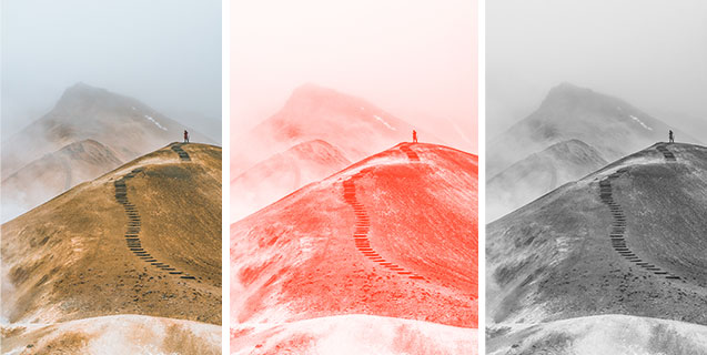
Monochrome Effect. As the name implies, you can use a filter to convert a colored photograph to a monochrome (single color) palette or to discard color altogether. Compare the photographs below: full color (though muted), monochrome and gray scale. Notice how color influences the forms, space, patterns, and the mood of each one.
Duotone Effect. Recolor a person or object using only two colors. Perhaps you can make the effect become part of a story. Every time the protagonist struggles with a problem, we see them in these colors.

6. Use Vector Illustrations
One approach to the stock photo doldrums is to ditch the photos for vector images. These are illustrations that are not resolution dependent. That means in a vector graphics program like Illustrator, Inkscape, or Vectr, you can enlarge the image without a loss of quality. Once you convert a vector graphic into a PNG or JPG format, however, it becomes a bitmap image and loses its resolution independence. That means you will need to first scale the illustration to the desired size and then convert it to a bitmap file type. Also, PowerPoint accepts SVG files. Below are examples of vector illustrations representing the idea of working from home.


7. Show Part of An Object
Sometimes you only need a hint of an object to create meaning. To do this, start with a large photo and crop it so that only a recognizable portion of the object shows. The viewer should be able to recognize the object quickly, so that it doesn’t become a distraction. Or you may find a cropped object photo in a stock photo collection. In general, I recommend cropping stock photos to fit your purpose and design.

8. More Ways to Modify Photos
You can find free stock photos and more tips on modifying them in the articles below.
- How to Crop Photos for eLearning
- How to Crop a Photo to a Circle
- How to Establish a Visual Hierarchy in eLearning
- 10 Lesser Known Free or Inexpensive Stock Photo Sites
Photo Credits
- Forklift: Photo by Elevate
- Low angle shot: Berenice Melis
- High angle shot: Cottonbro
- Montage bottom row center: Gabby K
- Montage bottom row left: Antonio Milian
- Colored gears: Digital Buggu
- Zurich: H. Emre
- Misty mountains: Alexander Milo
- Horses: Pixabay

Glad you found it valuable.
Excellent techniques! Thank you very much, Connie!
I love this article. Funny, how some concepts are intuitive. I like cropping or changing the focus, but there were lots of interesting tips. Thank you.