

An important dimension of eLearning is communication through the elements on the screen—the visual elements, text, and graphic space. The arrangement of these elements transmits a secondary message through its visual hierarchy. In visual design, a visual hierarchy establishes the relative importance of each object on the screen. A visual hierarchy for eLearning is an important factor in guiding attention. For more on attention, see 10 Things You Should Know About Attention.
A visual hierarchy directs the learner through a progression, starting with the element of the highest rank and continuing to those with lesser rank. Although it varies, a standard visual hierarchy consists of three levels of importance. In the graphic below, there are three levels of hierarchy on the screen.
In this article, I use visual hierarchy examples from web design that you can apply to a visual hierarchy in eLearning design.

Visual Hierarchy in Office Ergonomics course by Prometheus (from Articulate Showcase)
Thinking Through the Design
Without a hierarchy, a cluttered screen can be overwhelming. A viewer doesn’t know where to look first. On the other hand, a screen with no hierarchy has no emphasis. Attending to the visual hierarchy gives you another way to communicate information.
Visual hierarchy is all around us in architecture, newspapers and advertisements. Once you tune in to the concept, you’ll see how designers of all types purposefully arrange, group and emphasize visual elements to communicate their significance.
Assuming you’ve done the obvious, and thought about which elements are most important on a screen or slide, the next step is to determine the best way to denote the hierarchy. Some ways you can do this are through imagery, position, color, size, typography and animation (or the sense of movement).
In practice, most designers combine several approaches as a natural outcome of good design practices and for greater impact. Read on for more info on different ways you can establish a visual hierarchy and to see examples from web sites and eLearning courses.
Imagery
Images typically attract the eye first, then the text. But it depends on the design and treatment of the composition. Size is a big factor.
You can usually assume that a good-sized image in a prominent location will be at the top of the visual hierarchy as in this personal site by interactive designer Victoire Douy. Viewers will most likely see the smaller text in the upper left and right after seeing both the illustration and the word “SHUFFLE.”
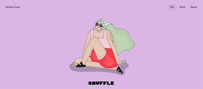
Also notice that isolation is another factor in the visual hierarchy. The ample white space around the illustration makes it stand out.
Position
Positioning is one of the most common ways to depict visual hierarchy. We’re familiar with this idea through the importance of articles “above the fold” in newspapers and websites.
TechCrunch and similar online magazines use positioning to establish the hierarchy. They take advantage of the fact that we read from top to bottom and left to right. The TechCrunch example below follows this pattern, using both color and positioning. For most viewers, the colored title text at the top establishes the primary hierarchy. Then immediately below that is the second level. Articles in the column on the right create the third level.

Color
Color is often used with contrast to establish a hierarchy. Because brighter colors attract more attention, elements high in the hierarchy should be vivid; elements of less importance should be muted. Learn more about working with color.
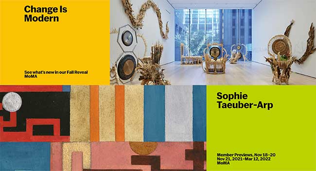
In the example from the Museum of Modern Art in New York, the bright squares of color create the primary level of the visual hierarchy. The photographs of the exhibits are more muted and secondary.
Size
We are also attracted to the largest object on the screen, making size a compelling way to depict hierarchy. This is a familiar tactic, such as when a designer uses a larger type size for the title of a page or slide. But there are other ways to use size.
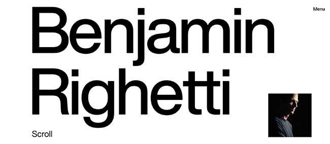
In this example from a personal website of musician Benjamin Righetti, the scale of the text puposely overpowers the small photo.
Typographic Hierarchy
You can establish a visual hierarchy through typography, which should reflect the information hierarchy. When using type to depict hierarchy, think in terms of its style, size, weight and color.
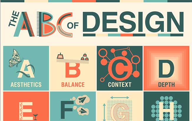
This colorful ABC infographic example from Design Mantic has three clear levels of a typographic hierarchy: title, individual letter and the term.
Animation or Motion
Movement is an attractive element. An animated object on the screen is often the most significant. Movement can also be expressed through line and shape, as a sweeping visual force. In the example below, several elements create a sense of movement from right to left. These are placing objects on the diagonal, use of curvy shapes and lines and objects faced in the same direction.

Conclusion
If you focus on the visual hierarchy of your eLeanring and slide designs, it will bring clarity to your work. Establishing a hierarchy should make it easier for learners to process information, because they’ll know where to focus.
RESOURCES:
Get the latest articles, resources and freebies once a month
plus a Visual Design Cheat Sheet.

Hi Wencke —
I see we think alike as I love Robin William’s books too and recommended one in this list of 10 Books Recommendations From Varied Fields.
Thanks for your comment,
Connie
Your tips are very useful. I also learned a lot on basic design principles from Robin William’s “The Non-Designer’s Design Book: Design and Typographic Principles for the Visual Novice” She has these also for Webdesign and Presentation design. Very useful filled with a lot of examples.
Excellent post!
very useful, thank you very much!
Vero
Greetings, I stumbled upon your blog and examples and was pleasantly surprised to see you reference a sample from my eLearning Portfolio for your Animation or Motion example. Small world indeed! Thank you for the kind words. The team which contributed to this eLearning Course were phenomenal to work with; Keely DeKoskie and Mark Burkey. GREAT team!!