
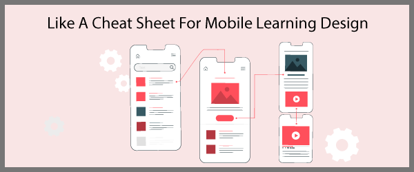
Are you involved in mobile learning design? Do you need to design mobile performance support? Wouldn’t it be easier if you had a way to think through how users will move through your product and how you will structure it? That’s where design patterns come in.
Design patterns are collections of solutions for various types of challenges, such as how to design input forms that work well on a phone or how to design menus for various types of content.
Is Mobile Learning Design Still Necessary?
Many of today’s authoring tools are responsive, meaning products designed for the desktop will work on all screen sizes. Yet in many cases, translating this large screen design to a mobile device can result in a cluttered and unfriendly design. That’s why you may choose to design for mobile first or create a unique product designed for mobile alone. See 10 Tips for Designing Mobile Learning and Support for additional guidance.
Study Design Patterns for Solutions
The user experience and interaction design communities do a good job of identifying and collecting design patterns to help others find solutions. I wish we did more of this for mobile learning design. By collecting patterns, the designs begin to get standardized, which is good for users. In addition, collecting patterns demonstrates the best practices in a field. Most important, design patterns provide a resource for designers to find workable solutions to user interface and other challenges.
Using a few books and websites (see the Resources at the end), I’ve collected some mobile design patterns you may find useful for creating all types of mobile experiences (mobile learning, just-in-time support and apps). This article focuses on common design patterns for navigation.
But first, let’s look at some guidelines for designing navigation.
Navigation Guidelines for Mobile Learning Design
- Think differently. Rather than thinking in terms of a mouse pointer, think in terms of gestures, such as taps, swipes and pinches. These are all part of the gestural user interface.
- Prioritize the features people will use first as they enter the mobile experience. It might be to learn, to find information or to complete a task. Then ensure that the navigation is optimized for quickly accomplishing the task at hand.
- Ensure the touch target is sufficiently large for users to tap without making errors or getting frustrated. Touch target size guidelines are available for each mobile operating system.
- Use visual cues that orient users to where they are in a program. Examples include a back icon that displays on a secondary screen and the title of the current category.
- Be consistent in the navigation model, icons and labels. This will help users build appropriate mental models of your app’s architecture.
Primary and Secondary Navigation
It’s helpful to think about navigation interfaces in terms of primary and secondary levels. Primary navigation is persistent and always available. It provides a consistent structure for moving around an app. It is typically based on and represents the information architecture.
Secondary navigation is transient. It displays in context or after selecting a primary navigation element. For example, in a reference app, after selecting a category, a list of selectable terms might appear.
Now, here are some common design patterns for navigation in a mobile environment.
Using Cards in Mobile Learning Design
Cards are a flexible user interface structure consisting of shapes that look like physical cards with boundaries and edges. They contain information chunks that can be arranged in various layouts and combinations depending on the device size and context. Pinterest uses a card-based design.
The card-based interface is not merely a box of text. It is an element that embodies action. A card can be swiped to move to the next one as in the mobile learning app Google Primer, shown below. Or a card can be tapped to navigate to a new location. See the screen shots below. Some are saying that cards of aggregated content will eventually replace web pages.
Because cards are based on a familiar metaphor of a card deck, there is an intuitive sense that you will be able to touch it, move it and interact with it. Card-based design could be an ideal user interface for performance support. It provides a condensed way to present many types of media, it entices users to engage and it performs well on varied sizes of devices. The 7Taps authoring tool uses a card-based design for mobile learning.
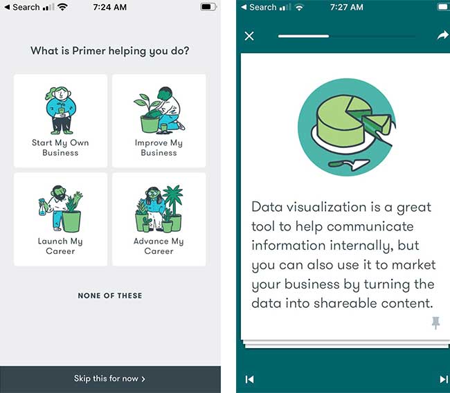
Card design from Google Primer
Image Grid or Matrix
Using an image grid for navigation is a bandwidth-heavy but visually appealing user interface. It is a good choice when there are many content entities of equal importance and when visuals are key. You often see this in retail apps and websites where images of products are displayed in a grid.
Note this word of warning from the user experience research group, Neilson/Norman, “For mobile navigation, image grids should be saved for deeper IA (information architecture) levels where visual differentiation between menu items is critical, as they increase page load times, create longer pages, and cause more scrolling.”
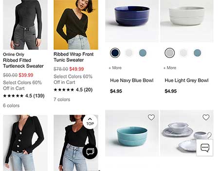
Image grid pattern
Launchpad
The launchpad is a landing page with icons, which are are typically arranged in a grid pattern. The icons serve as navigation options for selecting tasks, categories of information, or in the case of operating systems, to launch applications.
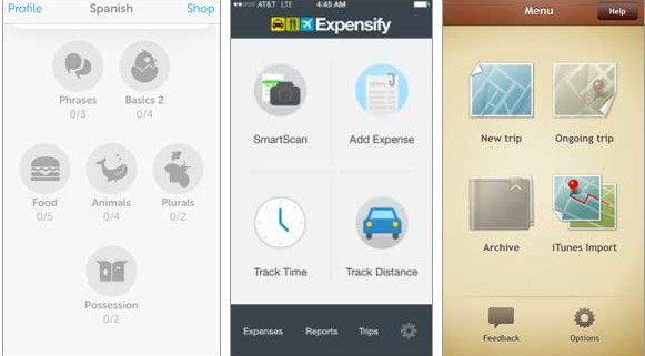
The launchpad user interface found in Duo Lingo, Expensify and Trip Journal
List Menu
The list menu is a native format for displaying navigation options in a text-based or graphic list. Each item on the list is a link to navigate to a specific location. Looking at the three types of lists below, you can see how the design is aligned with the needs of the user.
The productivity app, Things, groups the list options in a logical arrangement. Kayak, a travel app, uses informative icons to enhance the categories for which a user can find information. And the photographs displayed with each Ted talk make the options compelling.
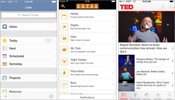
A variety of ways to show lists as seen in the Things, Kayak and Ted apps.
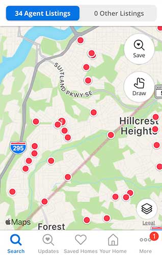
The Map User Interface for Mobile
 Sometimes geographical or location information is key to the task users want to accomplish or is relevant to the content they need. For example, in the travel and hospitality industries, employees may need location-dependent training.
In these cases, navigating with a map user interface might be a sensible choice. A good example is the real estate app, Zillow, shown below. The red markers indicate selectable objects, in this case real estate. Selecting one of these dots on the map displays a photograph of the house.
Off-Canvas Menu Mobile Design
The off-canvas menu is a way to save screen real estate. It’s a design pattern for responsive websites as well as for mobile apps. A common strategy is to display a hamburger icon—a menu icon consisting of three lines—at the top of the screen. Upon selecting this menu icon, the off-canvas menu typically slides in.
This slide-in menu is also called a navigation drawer. You can find off-canvas menus in news and magazine apps that have many categories of information. Facebook currently uses the drawer menu too.
The main drawback to this approach is that if the app architecture has more than two levels, it is not always clear how to get back to the main screen. See A Look at the Off-Canvas Menu for more on the off-canvas menu.
Skeuomorphic Mobile Learning Design
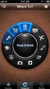 Metaphors that are based on objects in the physical world seem to be decreasing in use as a means of navigation, other than in games. But using an underlying metaphor might make sense for your audience if they would benefit from a familiar mental model of how something works.
For example, at one time, a bookshelf metaphor was a popular user interface strategy for reading and library programs. The example below shows a dial metaphor used in an older app called Where To? Skeuomorphic designs are somewhat dated as they are used less often in mobile design.
Tab Bar
The tab bar is a familiar user interface element because it resembles the desktop toolbar. Consisting of a row of persistent buttons at the bottom or top of the screen, the tab bar is a common UI element for navigation in smartphone apps. I can attest that once you have the information architecture of the app figured out, it is an easy type of navigation to design. See some tab bar examples below.
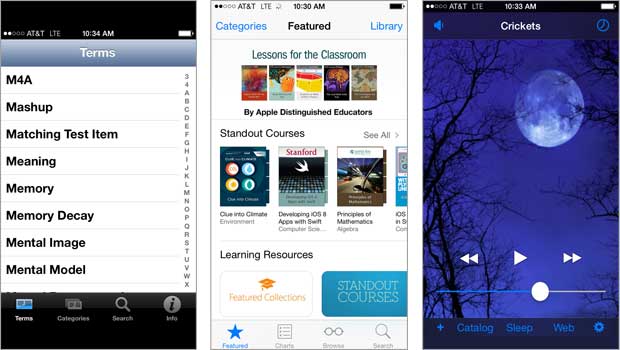
Tab Bar navigation in the Instructional Design Guru, iTune University and White Noise apps.
What type of UI strategies do you think would work best for your project? Share your ideas below.
References
- Mobile Design Pattern Gallery: UI Patterns for Smartphones by Theresa Neil
- The Mobile Frontier by Rachel Hinman
- Microinteractions by Dan Saffer (hear my interview with Dan)
- Designing Interfaces: Patterns for Effective Interaction Design
Websites
Thanks, Joan! Hope you’re enjoying the course.
Connie
Excellent article. I’m taking the ATD Mobile Learning Certificate course. Your review of design patterns is very helpful! Thank you,
Joan