
Before you just place any old photo into an eLearning course or slides, it’s a good idea to think about whether a realistic graphic for learning will be effective. And if so, how much realism is needed?
By realism, I mean the degree to which an image is a successful copy of its referent. A common assumption is that more realism corresponds to greater comprehension. Although that seems intuitive, this assumption is not based on fact. Realistic graphics, are often not as effective as those with reduced realism.
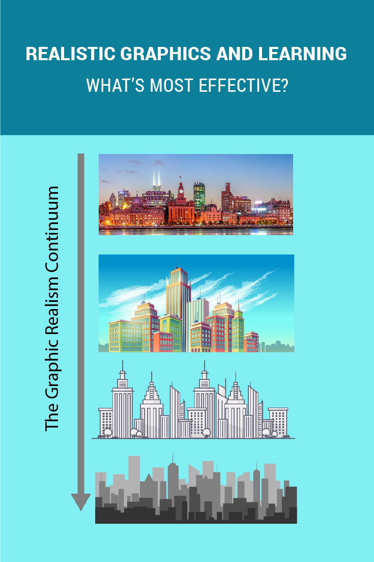
The Realism Continuum
One way to think about realism is in terms of fidelity, or how much an image resembles something recognizable. On a continuum, visuals with the highest fidelity are photographs in full and natural color and photorealistic 3-D renderings. You can tell when a graphic is high-fidelity, because you will see a lot of detail, depth, shadow, texture and nuance of color that nearly replicates what we you see in the physical environment. In the image below, the photo at the top has the greatest fidelity.
Graphic Realism Continuum from High Fidelity to Low Fidelity
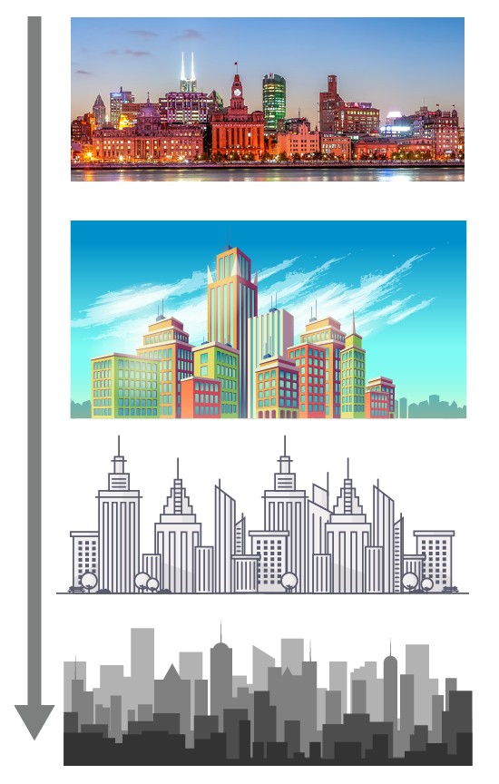
On the other end of the continuum are visuals with low fidelity, such as line drawings, silhouettes, and icons. Low-fidelity images use fewer visual attributes and qualities that resemble a recognizable object. They may have less color, a flatter appearance and less visual noise. Reducing realism reduces the fidelity of the image. The line drawing and silhouette above are at the low-fidelity range of the continuum.
Low-fidelity Graphics and Learning
Low-fidelity graphics can be more effective for learning when you need to:
- Provide an explanation to people with limited knowledge of the content
- Focus only on essential details
- Ensure viewers recognize an object quickly
- Strengthen the impact of a message
For example, you might choose low-fidelity graphics in a beginners cooking course that is explaining the use of various utensils. In contrast, high-fidelity photographs would work best when teaching more experienced chefs about presentation of the final meal.
Advantages of Low-Fidelity Graphics
Some of the cognitive advantages of low-fidelity graphics include the following:
- Quick Visual Scanning: When we read an image, we scan it to extract significant information. A graphic composed of a minimum of visual elements, such as a line drawing, will take less time to scan and assimilate compared to one that is more complicated, such as a natural scene in a photograph.
- Less Information in Working Memory: Working memory has a limited capacity and is easily overloaded. Distilling a graphic down to its essential visual elements minimizes the amount of information that working memory has to simultaneously manipulate.
- Fewer Distractions: The presence of unnecessary elements can distract the viewer from focusing on the key message.
- Fewer Misunderstandings: Superfluous information can potentially cause misunderstandings. A minimalist approach could avoid this problem.
- Less Information to Process: Many cognitive researchers think that as the brain processes visual information from a graphic, it removes the nonessential sensory input and converts it into a bare-bones representation of crucial information. Low-fidelity graphics, therefore, require fewer transformations and take less time to get them ready for encoding into long-term memory. See this article on cognitive load.
Francis Dwyer spent decades researching various attributes of visuals and how they affect learning. When it comes to graphical realism, he writes, “An increase in the amount of realistic detail contained in an illustration will not produce a corresponding increase in the amount of information a student will assimilate from it.”
Many times, you can achieve the most effective visual communication by abstracting and simplifying a graphic. You will need to balance the goal of reducing realism enough to improve cognitive processing, while at the same time, leave enough detail so that viewers will comprehend the graphic as it was intended.
References:
- Dwyer, F. The Program of Systematic Evaluation (PSE) 1965-2007. College of Education, Penn State University.
- Malamed, C. Visual Language for Designers: Principles for Creating Graphics that People Understand, Rockport, 2009.
Get the latest articles, resources and freebies once a month
plus a Visual Design Checklist.

Hi Clarissa,
I agree with both points. I like the inclusivity of low fidelity graphics, like icons and silhouettes. They represent the general concept without getting into the details and features, say, of a person. This can be really helpful when you want to be inclusive. Thanks for sharing your ideas.
Connie
Connie,
Thank you for your helpful article along with the websites listed. I will certainly be making use of them in the future. Another positive in ID with low fidelity graphics is making the participant aware of what is expected. A repeated graphic of an open book when additional external reading is required or of a pen when notes should be taken can queue the reader that there are additional steps to be taken.
There is also a case to be made that low fidelity graphics are more inclusive. The low fidelity focuses on the message rather than age, sex or race within a high fidelity graphic.
Graphics are the best way to represent a point and easiest way to understanding an item of discussion.
Hi Debra,
I can picture your solution and it’s elegant. Thanks for your comment!
Best,
Connie
What I liked about your article pertaining to low fidelity graphics is that it is common sense. Recently, I created a module about business ethics and the instructor cited a case involving Arthur Murray Dance Studio. I didn’t want to use images from their website nor did I want to insert stock photography. Instead I chose a silhouette of a ballroom dance couple. I wanted the image to accompany the case material, not over ride it. Well done.
Hi Andy,
Here’s an article on this site about Learning from Visual Data: https://theelearningcoach.com/?p=6166. In addition to coolinfographics.com, here are some of my face infographic sites:
http://infosthetics.com/
http://www.visualcomplexity.com/vc/
http://eagereyes.org/
http://www.vizworld.com/
There are many many many more!
I saw a mention of infographics which I’ve just recently become curious about. Here’s a good blog on the subject that has some really good visual representations of complex concepts and statistical data: http://www.coolinfographics.com/
enjoy.
Hi Will,
I agree that audience characteristics and level of expertise go into the equation and I sure didn’t mean to imply otherwise. Perhaps I’ll ammend the article to make it more clear … or write another one. Look forward to checking out that research too. Also, line drawings are often more appropriate than cartoony, for instructional graphics.
Thanks for your input,
Connie
Coming from a graphic artist I don’t think this article is entirely accurate. It depends on what you want to represent. A very cartoony representation might not be a better choice then a photograph especially if your audience are Graduate student. There have been several studies that actually show that more comic style is better then cartoony or 3D rendering especially for Virtual agents. You can find that study if you do a search for “The Pedagogical Agent in Online Learning: Effects of the Degree of Realism on Achievement in Terms of Gender”
Hey Neil. You’re right, “eye candy” can have a negative connotation, which I kind of forgot about. Anyway, I see what you’re getting at. The whole design aesthetic needs to be improved. I agree. When talented graphic designers work on a course, it makes all the difference. I also think IDers who are designing courses can get trained in basic principles of visual design.
Thanks Connie.
However, I wasn’t just talking about “eye candy”. Eye candy has a connotation that it’s useless. I was talking about the ‘design aesthetic’ and the use of grids and graphics etc. There is a lot of really bad looking eLearning being created out there (and not just the rapid stuff) and I certainly don’t get into courses that look bad. In fact, I don’t even bother doing them regardless of how good the content might be on the next page I click. I think there is a huge void in eCourse design and development that needs to be filled by graphic designers, artists etc …
Excellent point, Neil. Eye candy makes a course attractive and it motivates viewers. As designers we have to find a balance so it draws people in rather than distracts. In terms of the realism continuum, I think aesthetic graphics are usually on the realism end of things. Your thoughts?
Great topic to discuss.
Using a graphic/image to ‘represent information’ (as in infographics) is different to using a graphic to enhance the ‘aesthetic’ of a page in an eCourse. The visual ‘aesthetic’ of an eCourse is also very important for keeping learners engaged with the course. People enjoy viewing, and get drawn into, ‘objects of beauty’ and thus become more enthusiastic to engage them. Quality magazines are a great example of this. So, sometimes a graphic that enhances the visual aesthetic of a page in an eCourse that doesn’t have a direct relationship with the information/knowledge being communicated to the viewer serves a great purpose even though it could be considered gratuitous. I think that eCourse design should draw more inspiration from ‘art, architecture, and advertising’ than it currently does in the majority of cases.
Interesting that you brought up USA Today. There is a lot that eLearning designers and developers can learn from the field of infographics. In fact, I’m going to be making a presentation to infographic professionals in the near future. The corollaries between the two fields are huge. Thanks for your comment, Andrew.
Great points! I’m a huge fan of NOT having what I’d call gratuitous graphics. If you’re going to insert an image it must add value. I like the ideas here that at times “less is more”.
Whenever I travel I love to pick up the USA Today at the hotel and look at the front page. They always have some type of graphical chart on the bottom left. It’s amazing how so many “words” can be portrayed through one small graph or what I like to call a “process picture”. Again, thanks for the post.