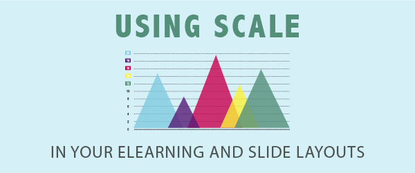
One powerful aspect of visual design you may not be optimizing is the use of scale in eLearning layouts. Scale can also work in slides, print manuals, and job aids. This design principle has the power to enhance visual communication or to detract from it.
What is Scale?
Scale refers to the size of an object in relation to other objects on the screen or page. In the book Graphic Design Rules, author Sean Adams, writes that “Good composition is a mix of scale, shape, and color working together dynamically in harmony.”
You can see how designers use scale on product websites. For example, at Apple’s website, their latest product is often scaled to an overwhelming size. You can barely notice anything else. In fact, they will often isolate the product on a solid background for greater impact. This ensures that the viewer’s eyes will focus on the product alone.
Scale Shows What Is Important
Every visual composition needs a focal point. Varying the size of elements in an eLearning or slide layout allows you to create a focal point. This shows what’s most important in your communication. When one element (image, shape or text) is much larger than the others, it draws attention to the element. Without variety and contrast in size, a design can feel flat or dull. If everything is the same size, then nothing is important. In the title screen below, the emphasis is on the person. This would be the main character in a subsequent scenario.

Scale Provides Depth
Varying the scale of objects helps to create depth. Large objects seem to appear closer to the viewer while smaller objects seem to recede. This creates a sensation of three-dimensional depth on a two-dimensional screen or page. Notice the appearance of depth in the photo above.
Scale Helps to Establish a Visual Hierarchy
Size is one factor for establishing a visual hierarchy in a layout. It is a way to guide the viewer’s eyes to the dominant element, then to the next dominant and so on. We are typically drawn to the largest object in the hierarchy. Attributes other than size can also establish a visual hierarchy, such as a bright color, positioning (top and left) and contrast. A visual hierarchy allows you to emphasize one element over another. In the photo below, the building with the title text is the dominant feature. Compared to the image above, the person is less important in this hierarchy. Learn more about establishing a visual hierarchy.

Isolation Draws Attention Too
Scale also refers to the relative size of an element in relation to the graphic space that contains it. Think about the size of an element when compared to the dimensions of the screen or page. Interestingly, a small element isolated on a large background also creates a focal point.
Oversized Objects
One more thing you can do with scale is to oversize an object. You can achieve this by enlarging the element so that it doesn’t fit in the space provided. That is, the edges of the object fall off the screen or page so that the viewer does not see it in its entirety.
Consider Context
When designing, it’s important to consider scale in the context of where it will be viewed. If a design is meant to be viewed from a distance, such as a presentation in a large auditorium, well-sized elements and bolder typography may be necessary to grab the viewer’s attention. Conversely, if the design is meant to be viewed up close, smaller details and finer typography may be more appropriate.


You’re welcome Wanda!
This is very helpful as I continue to build upon my eLearning knowledge.
Thank you!
Wanda