
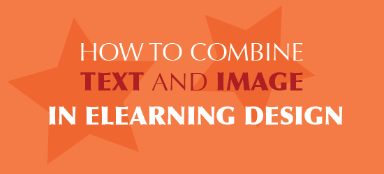
In visual art and graphic design, a composition is the arrangement of visual elements into one cohesive whole. In eLearning and presentation design, every slide can be seen as a composition. The way that you combine text and image (including shapes) in a slide affects the message you convey and the visual appeal of the material.
For a cohesive design, text and image need to work in relationship with each other. Through placement, alignment, and balance you can ensure that they interact and work well together.
There are a lot of options for integrating text and image. What follows are guidelines for several approaches.
1. Text Overlaid on Image
Let’s start with a guideline that seems obvious, yet is not always followed. When text overlays an image or a solid color background, there must be sufficient contrast between text and image to make the text readable with little effort. Photo courtesy of Unsplash.
Images that work as a background for text include:
- Photos with large flat solid areas of color, like the sky, a wall, the ocean or a shadow
- Light patterns or textures, like canvas, linen or faint geometric designs
- Out of focus or blurry backgrounds with a minimal range of colors (see Resources below for freebies)
- Uncluttered photographs, perhaps of one object
If the image doesn’t have sufficient space, consider a partially transparent box of a contrasting neutral color behind the text. Always consider the purpose of using a background graphic. Will it work to convey your message? Is it aesthetically pleasing?
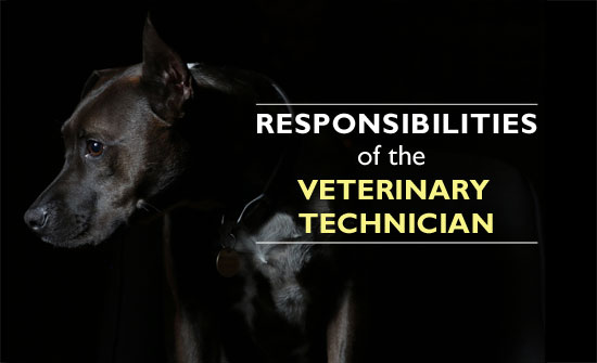
2. Text Wrapped Around Image

In the wrap-around, the text follows the shape of an image. The relationship between text and image is evident because the outline repeats the contours of the person or object, as shown above (cut-out server courtesy of the eLearning Brothers). To make this work, use an image that is relevant to the content. Perhaps a silhouette of a person performing an action, a hand gesture or a large object.
To achieve this in authoring tools or PowerPoint, you must place the text in separate text boxes and place them around the image.
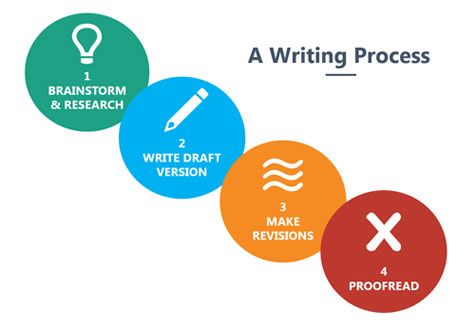
3. Text and Image Intersect
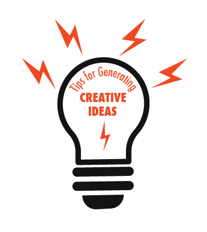

The intersection of text and image can create a dynamic composition. The visual elements can intersect in several ways:
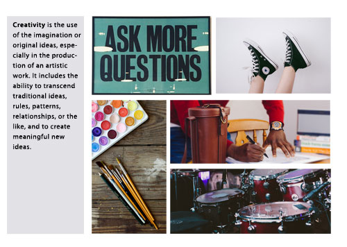
- Place text within an image, particularly a hollow vector graphic as shown in the light bulb above
- Use text behind an image so that it is partially obscured
- Rest the text on an image, using the image as the baseline for the text
If intersecting text and image makes reading difficult, then only use this approach for title and topic slides. Never sacrifice learning for a visual design idea. Notice that many magazine covers place the title of the magazine partially behind a person’s image, as shown above (cut-out person courtesy of eLearning Art).
4. Text and Image Aligned
You can achieve an orderly look by aligning visual elements with each other and placing them in close proximity. For example, when the left and right margins of a photograph are aligned with the left and right margins of a text box, as shown above, you can sense the connection between the elements.
Even though image and text do not intersect or overlap, alignment demonstrates a relationship. It also provides a clean sense of balance.
In this approach, spacing is critical. If the text and image are not in proximity, the relationship will not be as obvious. Unless you are purposefully seeking a very casual look or a bit of chaos, alignment works well for combining text and image.
5. Text and Image in Repeating Shapes
In visual design, repetition creates unity. You can create a cohesive design by selecting a shape and repeating it in different sizes and colors. By adding images and text to the shapes, you create a unified whole.
Shapes are part of our rich visual language. Think about what a shape represents before you decide to use it. Rectangles project stability and order. Circles give us a sense of unity and also continuous movement. Triangles are dynamic and seem to move the eye toward the point. When inverted, the triangle represents instability and imbalance as though it might fall over. Organic shapes are irregular and often represent nature. Many organic shapes are calming.
Conclusion
You now have five solid options for laying out a slide with text and images. As you arrange and organize the visual elements, keep an eye on the spacing between them. When the spacing between elements is uniform, you will create an underlying sense of order that makes it easy to scan and process the information. When the spacing between elements is varied, the design becomes dynamic. This can be motivating for some learners. Try some variety between spacing approaches in a way that provides both meaning and interest to your audience.
Thansk, JJ. Happy New Year to you too. May you have a joyful year of discovery!
Connie
You’re right, Michael. This article doesn’t fully account for a responsive design. It will work on an iPad-sized tablet, but not all techniques would work on the phone. For example, when aligning text and graphics, on a phone this content would be stacked. But really, I don’t think you can just take multimedia eLearning and run it on a phone unless it’s specifically been designed for the phone.
Thank you for this article, well done. However, with a push toward mobile delivery and what is called “responsive design,” the careful alignment and composition we are all fond of as educators is difficult to control. The form factor of the mobile device, window size and placement, and even the orientation in which the learner holds the platform all determine the arrangement and formatting of elements on the screen; adjusting itself in real time. Our best composition efforts are for naught.
We have had to bite the bullet and accept this “on the fly” reorientation of our online content when offering courses on mobile platforms. About the best I can do is to assure an image is always moved after the text explaining it!
Happy New Year Connie. Thank you, as always, for providing great information and tips!