If your eLearning, slides or job aides include quantitative content, you may be looking for ways to present numbers in a compelling way. There are several aspects you can work on. The first is visualizing the statistics or data in order to make the numbers concrete. This promotes comprehension and makes the numbers meaningful for learning. Another aspect is to focus on visual clarity. Display what is most important to get your message across. Visual clarity makes visualizations easier to process and understand. The third aspect is good design. Present numbers as part of an effective composition. When your visual design of numbers is aesthetically appealing, it will most likely have more impact.
How to Make Visualizations Meaningful for Learning
Before starting to create, examine your purpose for using statistics or data. Does the audience need to remember specific numbers? Are you using them to persuade? Most likely, you’re using statistics and data to make a point. When you know the purpose, you can then work on making the numbers meaningful.
John Tukey, statistician and author, wrote that “Much of what we want to know about the world is naturally expressed as phenomena, as potentially interesting things that can be described in non-numerical words (1990).” He argued that it is the phenomena derived from the numbers that are of most interest to people. So use numbers to help learners think about the events that underlie them.
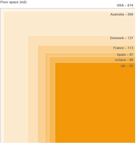
People are most interested in making comparisons, understanding relationships, seeing trends and finding patterns. This will lead to the recognition of phenomena. For example, when you see a bar graph that illustrates the average house size in a few countries around the world, you probably won’t remember the square footage in each location. Through an effective graph, however, you are more likely to remember the relationship of how home size in your country compares with others.
How to Create Visual Impact for Quantitative Content
In terms of visual interest, consider the approaches that are illustrated below:
- Emphasize specific numbers
- Make statistics concrete
- Transform data into a metaphor
- and combine statistics with a conventional symbol.
To visualize numbers that emerge from statistics and data, consider some of the approaches shown below.
1. Single Out Each Number
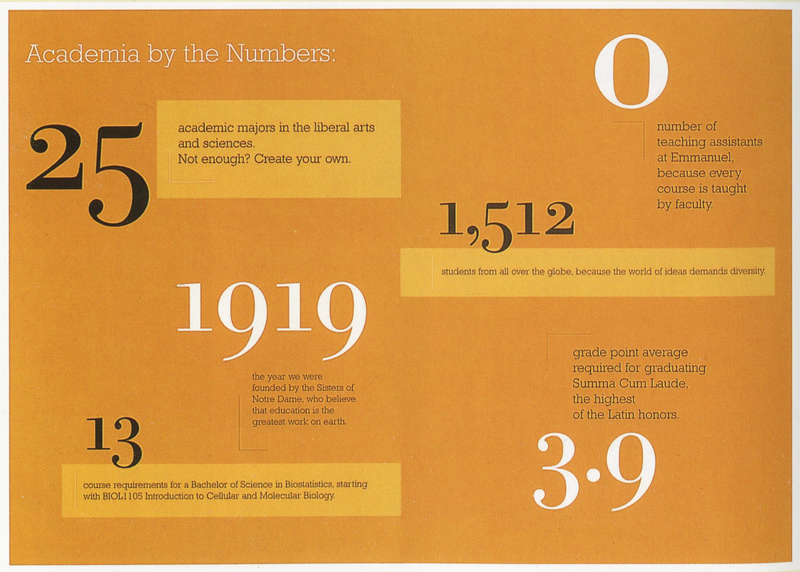
Let’s start with a simple fix. Did you ever see a slide, brochure or magazine pull quote that displayed a very large number? That’s one simple technique you can use if the number itself is very important and you want to emphasize it. This is easy to implement and yet it’s visually appealing.
The example below, from my book Visual Language For Designers, shows how numbers were represented in a college brochure. When using this design approach for eLearning or for a presentation, you may want to display one statistic at at time.
2. Make Numbers Concrete
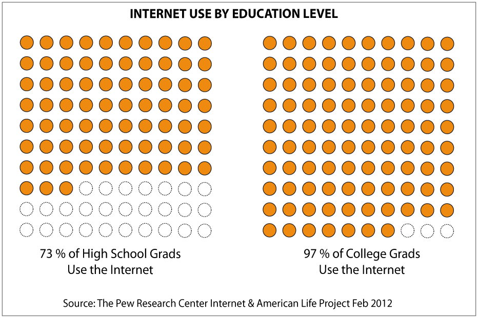
When we first learn mathematical concepts, we understand them by manipulating concrete objects. This capacity for understanding through the senses sticks with us for life. It’s basic to how we learn about the world. Whenever you can transform statistics or data from something abstract to something a learner can see or touch, you make it easier to comprehend and easier to remember. Perhaps because of this, it makes numbers more compelling.
This is easy to accomplish when you want to visualize percentages. All you need is 100 circles. Then color the corresponding number of circles to literally show what the percentage represents.
3. Transform Statistics with Pictograms
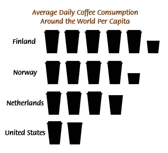
Another way to make statistics concrete is to display quantity using a pictogram. Pictograms are simplified or iconic graphics that resemble an object. If your statistics are about people, then you would use a simple person icon. After choosing your pictogram, determine the unit of measurement it will signify and then repeat it accordingly. For the coffee statistics below, the pictogram is a to-go coffee cup and each cup equals, well, one cup.
4. Make Comparisons
Our brains are more suited for making comparisons than for remembering a specific number. In fact, comparisons are often the core of one’s interest in numbers. As long as a comparison has a common frame of reference, it should work to express your message. This means compare apples to apples and oranges to oranges.
Most people are used to making comparisons with bar charts. In the example shown here from the BBC, home space in six countries (expressed in square meters) is displayed as set of rectangles. Not only does this allow for easy comparison, but it reflects the objects being compared (houses are usually rectangular), helping to make the numbers concrete.
 See original image on BBC site (scroll down when you get there).
5. Tell a Data Story
Incorporating data into a visual story provides context for your numbers. It makes them interesting and even intriguing. But it might be the most difficult of these approaches. You need to develop a three-part structure around the data and to use storytelling techniques. The structure is setup, conflict, resolution. For more on this see Hans Roslings videos where he incorporates data storytelling.
6. Create a Metaphor
Can your statistics or data be associated with a familiar object? Even if the association isn’t perfect, this approach can go a long way to making things interesting. Think of the way the United Way uses a thermometer to indicate how close they are to reaching their fund-raising goal.
Similarly, I’ve used a gas gauge to show how far we’ve come to reaching my fictitious goal for a monument to instructional designers. (Any architects out there?)

7. Use Familiar Symbols
When you combine statistics with symbols, you’re adding a second channel to your message. In addition to communicating a statistic, you’re conveying it’s broader meaning.
The triangle-shaped road sign indicates a warning or important information. You can also find this symbol in computer system messages when a problem occurs. Delivering a statistic on this symbol signals a warning—that the information is a problem that needs to be tackled.

References:
- Tuckey, John. Data-Based Graphics: Visual Display in the Decades to Come. Statistical Science, Vol. 5, No. 3, August 1990.
- Wainer, H. Graphical Visions: From William Playfair to John Tukey. Statistical Science 1990, Vol. 5, No. 3, 340-346.
Get the latest articles, resources and freebies once a month
plus a Visual Design Cheat Sheet.

Leave a Reply