 If you’re flying by the seat of your pants when it comes to graphic design, you may find that attention to visual space is a quick way to achieve a more professional look. Space is the neutral region of a graphic that is broken by text and visuals. Although the concept of space is just as important to consider as words and visuals, it is often overlooked because it’s just there in the background. However, it’s important to know how to use white space in eLearning, slides, job aids and other training materials.
Positive Space/Negative Space
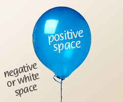 As you design, you can consider space in general and negative or white space in particular.
In the world of visual art and design, positive space is occupied by the forms on the page, screen or canvas. In our world, this is the text, photographs, shapes and illustrations that provide explanations or activities for learning.
Negative space is the area around and in between the forms. It can be any color.
There are many approaches to layout in screen design that leverage the value of space. Some ideas for you to work with are shown below. It’s always best to purposefully choose an approach that’s in line with the message and tone you want to communicate.
Being Generous with White Space
If you start to examine how white space is used in magazines, book covers, wine labels, menus and advertisements, you’ll see that the generous use of white space often expresses elegance and sophistication.
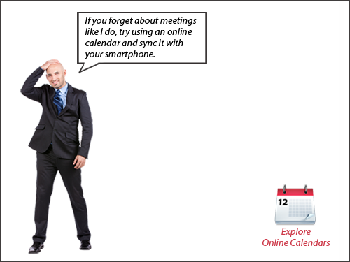
But there’s another reason for using a generous amount of white space. It gives the eyes a place to rest. It gives the brain an opportunity to perceive and process information. And white space has the tendency to slow things down.
If you design so that every screen or slide has one main instructional point or activity, then you can use this approach with just one person or object on the screen. The generous use of white space almost forces the learner to focus on that one point because there are no visual distractions. Downside: watch that your minimalistic approach doesn’t get too repetitious or boring. So mix it up a little.
Eliminating White Space
At the other end of the continuum, you can use a large visual element that extends to the edge of the page or screen as shown below. It is said to bleed. A bleed has no margins or white space. It gives an image impact, because of its size and power. There is no where else to look.

Using Margins
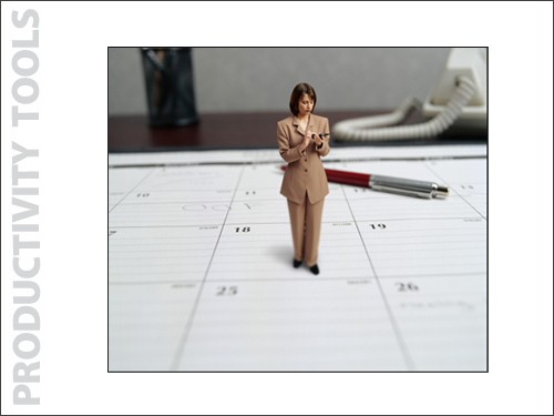
When you use margins in a layout, you’re creating white space around the visual. Notice how the photograph below has less impact than the one above because it is smaller. There are situations where you may not want an image to have a powerful impact. Margins provide some breathing room as well as a place to add text, as on this title screen example below.
Creating Asymmetrical Space
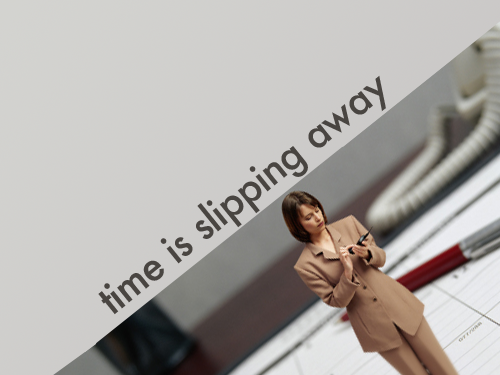
You can give a design an active or dynamic quality by creating one or more unequal regions of space. The imbalance, along with aligning forms on the diagonal, creates tension. Use this approach when it fits the mood and topic. I have to admit it’s fun to create asymmetry.
Pushing Space to the Outside
In their book, White Space is Not Your Enemy, authors Golombisky and Hagen state that a common error made by design beginners is to place visual elements in every corner of the design. This creates a cluttered look, making it difficult to know where to focus.
A more effective approach is to group related elements together, as shown below. This provides large areas of negative space, which makes a visual easier to process. (See The Power of Visual Grouping for more on how grouping improves visual communication.)
Why isn’t everything centered in this layout? A centered layout is acceptable, but an asymmetrical one makes things a little more interesting. And in an eLearning course, we might need that space on the right for something else, like rollover text describing each expert.

Adding Depth with Perspective
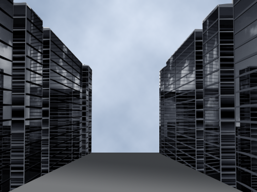
You can take two-dimensional space and create the illusion of spatial depth without being a Renaissance painter. One quick way to do this is to find a graphic with perspective at a stock photo site. Artists often achieve perspective through the use of two lines that appear to converge in the distance. The lines formed by the top and bottom edges of the skyscrapers below are an example.
The illusion of spatial depth can make a good visual for the opening scene of a storyline or for a transition because perspective adds a little realism as well as interest.
Another way to create the illusion of depth is to use scale. Place larger images in what will appear to be the front of the screen and smaller images with less detail in what will be seen as the back. The relationship between the large and small images (scale) creates the illusion of depth when placed appropriately. Play around with this idea and see where it goes.
So just to summarize, here are six ways you can use space in your designs:
- Being generous with white space
- Eliminating white space
- Using margins
- Creating asymmetrical space
- Pushing space to the outside
- Adding depth with perspective
Remember that space is a visual element for you to work with in every design. It’s of equal importance to words and visuals.

I enjoyed the article, especially the part on asymmetry. What a fun way to incorporate white space and graphics. Thanks!
I do a lot of presenting in the ethics space which tends to be textual. This will give me some innovative options in presenting case studies