

In a previous article, I wrote about the benefits of using checklists for performance support. But what about the visual design of a checklist that fits your needs? Consider that the visual design of a cognitive aid has both a utilitarian and an aesthetic aspect. As a practical tool, it must be user friendly. As an aesthetic experience, it should be pleasing to use, creating a positive affect. A well-designed checklist will have:
- Typography that is easy to read
- Design elements that make it accessible to a wide audience
- Clean layout so information is easy to find
- Sufficient white space for enhanced usability
- Clear visual hierarchy to guide the eye
- Optimization of all visual elements so you need as few as possible
- Design for keywords and phrases with boldface or italics to trigger memory of tasks and events.
Below I’ve captured a few types of checklist designs you may adapt to your needs. You can modify these designs if your checklist is for online use and take advantage of the expanded choices in the user interface, such as the on/off toggle switch, radio buttons and sliders. For ideas of how to organize content, see 10 Ways to Organize Instructional Content.
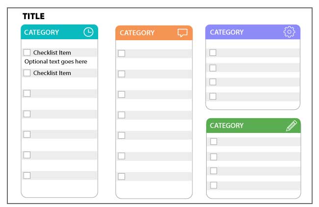
Design in Segments
Because you already excel at chunking, consider this design below. Break the content into categories and make each category its own checklist. Color coding is optional. Always use a secondary method of recognition, like an icon, to accommodate users who have trouble differentiating between colors. To test your graphics for different types of color blindness, see the Coblis—Color Blindness Simulator.
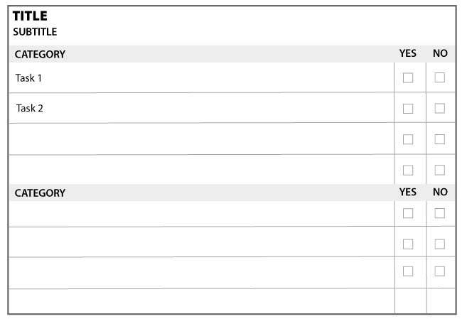
Design for Binary Responses
You may require a checklist that allows users to make a binary decision. Perhaps in a safety or quality assurance scenario, the input might be Pass/Fail or Yes/No. Or a job candidate may have a particular skill or may lack the skill. In these cases, a design for checking Yes/No or Pass/Fail would work. To add nuance, you could create a final column for comments.
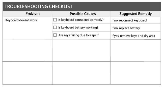
Design for Troubleshooting
A troubleshooting checklist can help the user diagnosis a variety of problems. It lets the user see and track diagnostic tasks that are completed and to see upcoming tasks. It could potentially replace a flowchart, or perhaps it could complement a troubleshooting flowchart. The added advantage here is that you can list solutions to a problem in one of the columns. The troubleshooting checklist is one way to standardize and document diagnostic processes.
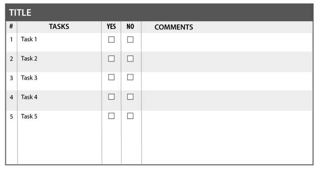
Additional Options: Sequential Designs and Room for Notes or Comments
Some additional options for checklists include numbering the tasks if order of completion is important. A Notes section might be a good addition to a checklist to make it a living document.
Get the latest articles, resources and freebies once a month
plus a Visual Design Cheat Sheet.

I have not seen research on this, but I just experienced it in your comment 🙂 Thanks for that. On the other hand, how does it affect the aesthetics? This would be interesting to explore.
Connie
I’ve learned from several others that CAPITALIZING important terms slows the reader down and offers IMPORTANT COGNITIVE ATTENTION to reduce errors. Have you learned this?
Clark – Those are great additions! Thanks.
Connie
I might add: design for key words, things that are triggers for particular elements. I remember a bank that had a really great checklist to use, and they weren’t using it. BUT, it expected rote use of the prose, instead of highlighting the key concept, which would allow you to rephrase to make more natural. Highlighting (even lightly, like just italics) can help make it more usable.