The user interface is the point of entry to an application’s functionality. Although the eLearning user interface is limited in capabilities, we shouldn’t disregard the impact it has on a learner’s experience.
Yet the default user interface in typical eLearning is problematic. It is based on a book-like model and uses dated user interface elements. With a little effort though, we can transform the default approach into one that provides a delightful experience.
In this article, I examine a few contemporary user interface patterns that we can adapt to eLearning. An updated approach to user interface elements can provide additional functionality and improve the overall design.
Here are some user interface elements found in web and mobile design that you can adapt to eLearning design.
1. Card-based Layouts

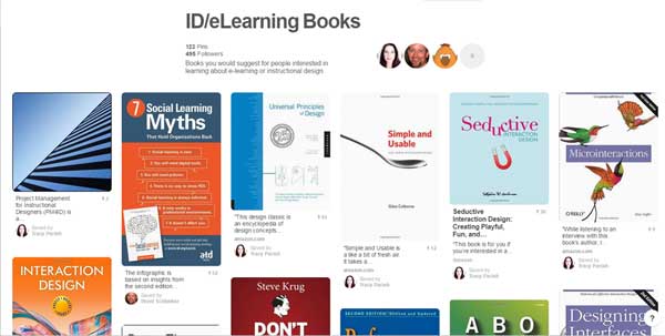
- Description: Cards—popularized on Pinterest—are rectangular content containers that represent a chunk of information. Users perform actions on cards. They can serve as menu links, vehicles for information display or a way to aggregate information. Cards typically use a photo or icon and text to represent the content.
- Benefits: Cards are ideal for online learning experiences because they present information in bite-sized chunks. They are a flexible interface. They can be placed in a grid to view all at once or in stacks to view one at a time. They are a flexible and clarifying organizational structure.
- Drawbacks: Cards may not work when presenting very complex content.
- Implementation: In eLearning, use the card-based layout for an enticing and non-hierarchical menu. Use them for content presentation with an image on one side and content on the back. You can use cards at the end of a topic to hold summary or review information.
- Credit:The image above is from the ID/eLearning Books Page on Pinterest by Tracy Parish.
2. Long Pages That Scroll

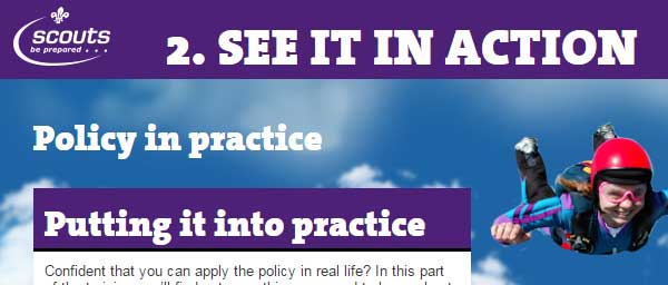
- Description: In the old days, web designers were told that users were too lazy to scroll. All of the important web content had to be placed above the fold. Fast forward to today and long web pages are the standard. Similarly, there is no reason to be tied to the horizontal slide format in eLearning. With the growth of HTML5 authoring tools, the mold is breaking.
- Benefits: A long vertical page of eLearning reduces the need for the dreaded NEXT button. It changes the book model of eLearning to a web page model, allowing for greater flexibility in how content is organized. With more content on one page (and hopefully more white space), learners can easily refer back to a previous concept. Long vertical pages also lend themselves to responsive design for viewing on varied devices.
- Drawbacks: Some users may not appreciate a disruption in their eLearning format. If they think of eLearning as a series of slides they will want it to remain that way. Also, long scrolling pages may not be appropriate for chunking certain content or for some interactions.
- Implementation: HTML5 authoring tools like Adapt, Evolve, GoMo and Rise are set up for this approach. I’ve also seen it implemented in traditionally slide-based tools by simply changing the size of the slide.
- Credit: The image above is from Scouts Association Safety Course from Kineo.
3. Hidden Menus

- Description: In the world of website and app design, hidden menus slide out horizontally or vertically when the menu icon is clicked. They are often used in responsive website designs that gracefully adapt to mobile devices.
- Benefits: Hidden menus save screen real estate because they only display on request. They also allow users to avoid returning to a main menu, which can be disorienting and annoying. When on display, hidden menus overlay the screen at any location.
- Drawbacks: User interface experts say that anything hidden could be ignored. Although this may hold true for mobile apps, the menu system in eLearning is an essential element for navigation. So I don’t think that maxim is relevant here.
- Implementation: Hidden menus are reasonably easy to implement with many authoring tools by using some form of a fly out animation. It may not be as smooth as using JavaScript, but it works. Consider adding check marks to the menu as topics are completed.
- Credit: The image above is from deModern, a German digital agency.
4. Hamburger Menu

- Description: On responsive websites and mobile apps, the hamburger menu (three lines) is often the trigger for displaying a hidden menu. Originally, this icon was highly criticized as frustrated users could not find the menu they were seeking. But now it is almost a standard. The corresponding toggle display for a hamburger icon is a large X for closing the menu. Note that the unlabeled hamburger menu is still controversial in terms of usability.
- Benefits: The advantage of using the hamburger menu even in non-responsive eLearning courses is that it is now a recognized symbol for displaying a hidden menu. As noted, hidden menus save on screen space.
- Drawbacks: Some users may not recognize the hamburger menu icon, particularly in an eLearning environment.
- Implementation: According to the Nielsen Norman Group, the hamburger icon should always have a text label, such as MENU, for good usability. That’s easy enough.
- Credit: The image above is from Brand Junkie, product designers.
5. Hover Animations

- Description: With advances in HTML5 technology, you can find hover animations all around the web. These are the effects that cause elements to jump, bend, pop-out, change color or pattern, or react in some way to a mouse hover. They not only add personality to a web page, but they can provide content and are good for accessibility by providing an obvious response to an action taken. When not overdone, hover animations delight users. See a few types here:
- Benefits: Hover animations provide one more way to present information, whether visual or in text, while users remain on the same screen. They are good for accessibility. Also, users may find creative hover effects appealing because of their novelty.
- Drawbacks: Hover effects do not last when the mouse is moved. This means the information will not remain on the screen. Like overuse of transitions and animations in PowerPoint, hover animations can be overdone. Like any design decision, they should be used with intention.
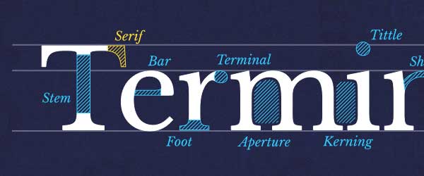
- Implementation: Many authoring tools provide a way to trigger a hover state. Use a hover effect to show a relevant selected area, such as in the Type Terms lesson. Hovers can provide additional information as in this content overlay or in a card-type menu as in these caption effects (select different effects at the top of the screen). And they can be fun as you’ll see at Waaark.com. Add instructions so users know to rollover with the mouse or thumb.
- Credit: The image above is from Type Terms, a fun way to learn typeface anatomy.
Get smarter about online learning with articles, tips and resources delivered to your Inbox once a month.

Our field has so much more than meets the eye, huh?
Connie
Hi Connie! It’s good that you pointed out how a user interface can actually affect eLearning. People talk so much about internet accessibility, connectivity, and other IT stuff but only a few notice the importance of UX.
One of my personal favorite UX solution is hamburger menu. I guess that the users are already quite familiar with the icon, so it it’s located in an accessible place on the screen, it will prove to be usable.
I think animation and tweaks of this kind are ok but when the course is already advanced. This way they could serve as a sort of reward.