Background
One requirement that hospitals in the U.S. must maintain for accreditation is to train healthcare personnel on high-risk issues. This includes topics like the type of protective equipment to wear, avoiding prescription fraud, reporting safety issues and dealing with workplace violence. These annual courses are typically updated with the latest policy and scientific information, but are often a jumble of unrelated topics.
The Situation
I was hired to rework one of these compliance courses to meet my client’s accreditation requirement. The audience was medical providers, which are healthcare personnel that render medical care, such as doctors, nurse practitioners, physician assistants and those with similar roles.
The Problem
There are no surprises here. Providers are very busy, already know a lot, and do not look forward to this type of training. Any more bad news? The course had about 15 mostly unrelated topics that the target audience needs to plow through every year. Many different SMEs contribute content from their area of expertise. Each SME probably considered the content they contributed to be the most critical of all. It probably was.
The Solution
Although this could be the perfect scenario for game-based learning, there was a short time frame for getting this completed. Also, asking the audience to go through the same simplistic game (which it would have been) year after year is asking a lot of them. Instead, I landed on the idea of an interactive magazine theme for this project. There were no page turns as you see in Flash-based formats. The user clicked a button to go from one two-page spread to the next. But there were questions with response choices and informative feedback.
Here were the advantages I considered the magazine format to have:
- Providers read medical journals to keep their knowledge updated, so this is a familiar format.
- Magazines have articles on different topics and this course covered a range of topics contributed by SMEs from a wide spectrum of fields. I could transform the topics into interesting articles.
- Rote memorization of the content would not be as effective as demonstrating its usefulness on the job. When possible, the articles would allow more leeway to feature stories or some type of relevant connection to the job.
- Journals typically have an introduction by the editor. I could use an introduction by a fictitious editor as a means to discuss the values of the hospital written by one of the SMEs.
- Brief questions and interactions within the magazine could serve as reinforcement of key points and allow us to remove the test at the end, which I am sure no one appreciated. The feedback to responses would guide learning.
- With a magazine theme, there would be more opportunities for creative writing. I could use a journalistic approach to titles, subtitles and articles that would make the course appealing.
- Sidebars in a magazine present additional or explanatory content related to the main article in graphics and text. This would present an opportunity to enhance the content in a unique and engaging way.
- It seemed as though updates would be easier on a big magazine spread and it wouldn’t be difficult to rewrite introductions and stories from year to year.
- It would be a fun challenge to simulate the writing and design of a magazine.
Implementation
For tools, I used Storyline 360, Photoshop and Illustrator to create the magazine. Here are some of the features I like about the magazine format.
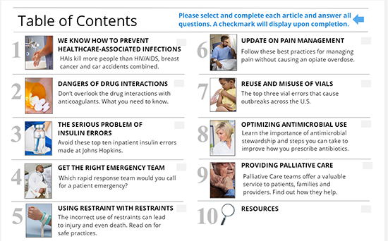
1) A magazine lends itself to focusing on feature articles. This is a good way to manage unrelated topics. Visual design tip: notice the head partially covers the magazine title. I first discovered this while waiting in line at the supermarket checkout. This is a common design approach for magazine covers. Since then, I’ve scoured magazine sites for visual design and writing ideas. Magazines have a lot to offer!

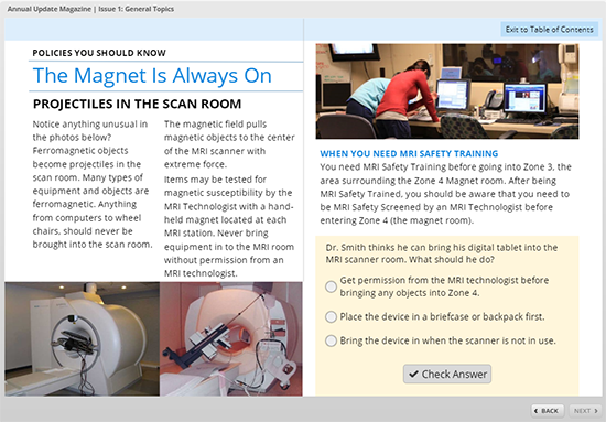
2) The table of contents works well as a menu. The user interface allows the user to return to the TOC at any time with a button in the upper right (see the last screen capture). Some of the article titles were based on journalistic techniques.

3) The layout is flexible enough to handle two columns on one page. It’s easy to sprinkle in questions that focus on key information and reinforce learning. This allowed me to remove the test at the end. Rather than using a “Submit” button on interactions, I used a “Check Answer” button. I think this subtle difference promotes self-directed learning.

Conclusion
I like this format for highly educated adult learners. It may work with other audience groups too. It’s a little more sophisticated than the typical eLearning courses they take. The articles can be written with a little more interest. And there is no tracking of how they respond to questions.


Sounds like a possible solution. Talk to a sample of your learners to find out their needs and habits. Prototype solutions and get feedback from them prior to going down one path to soon. Good luck!
Connie
Hmmm…
I am currently assigned to create a learning solution to teach/demonstrate to all levels of tech writers how to write with the user goal in mind instead of describing how the software works. 70 writers from all over the world (and still hiring) need to learn proper task analysis, simple language styles, and a new corporate voice and tone while working on two aggressive software releases a year.
There is a massive amount of content to transform. The idea of having writers read content to learn how to transform content is intriguing. If I can pull it off, the very structure of the learning solution will demonstrate how we want them to turn their focus around. Hmmm…
The ebook “Writing for instructional design” is excellent.
I highly recommend it. Should have known the tips 30 years ago!
Thank you Connie!
I love this. Like you say, perfect for the expert audience that simply needs to get to the information and needs no special introduction or handholding.
Debi — Illustrator is not at all required. You can just do it in Storyline. I only used Illustrator for some of the vector graphics. It’s not necessary … but Illustrator IS fun 🙂
Connie
Thanks, Anita. It was actually pretty easy to do!
Well put, Naomi!
You could have asked me 🙂
I love your idea, Evie. Can you shoot me an email via the Contact form and tell me what magazine publishing platform you’re using? I find the ones that publish to Flash are kind of difficult to navigate and use, so I’m wondering if you found something better.
Thanks,
Connie
You know, mobile was not a technical spec for this, so I did not design for mobile. It might work, but it seems like stacking all of this text could get really hard to read. I think I’d rather do something like swiping cards for mobile. Just an idea.
Connie
Rick,
I totally agree with you and Will and spaced repetition is the way to go if you can. I love the Cosmo Quiz concept. In this case, the stakeholder wanted the questions within the topic … sometimes on the same page! What I would really like to do is rather than quiz on the content, do some higher order problem solving or questions that involve deeper thinking. I tried, but needed SME help and there wasn’t enough time. Next year!
Connie
Cool. Glad you like the format. You have the sign of a true instructional designer. EVERYTHING looks interesting 🙂
I’d love to see what you come up with if you use this approach.
Connie
I like the Pseudo instructional designer moniker, Taffy. I’m sure you’re doing fine. Yes, this was delivered via an LMS and I used number of slides tracked rather than a test score. However, you could add up all the embedded questions into a score. I didn’t think a test was necessary, as I set it up so you couldn’t continue without answering the questions … if this makes sense.
Connie
Hi Edgar,
I used Articulate Storyline. I think it would be possible to use any authoring tool. Why don’t you shoot me an email via the Contact page and we can talk further.
Connie
Sounds like a good idea to revisit it, Nadine! It should satisfy those SMEs who always have a ton of text, LOL.
Connie
I did one of these a few years ago on security essentials where I work. Although ultimately the content owner wanted to go a different route to present the content, developing a magazine style concept helped get her onboard for the project in the first place.
Hmmm, maybe it’s time to revisit this for a different topic that I’d like to see roll out in a more serial format over the course of 2019.
Do you have any recommendations as to which software packages or online tools we can use to create a magazine such as this? Thank you very much.
As a nurse, online builder and pseudo instructional designer, I love this format! Storyline is an awesome program. I’m assuming you delivered this via an LMS?
This is so creative, thank you for the inspiration! It looks enticing enough that I’d like to read it lol. Very clever quizzing too, the answer isn’t obvious (at least to me) – three reasonable options in the example you show, would make the learner at least pause and think!
I love the concept, Connie, and the execution is beautiful.
My question relates to the effectiveness of the quiz being in such close proximity to the material. Will Thalheimer is an advocated for spaced repetition and I’ve read enough of his columns on the topic that I’m a little gun-shy of quizzing right after covering content. My suspicion is that a better quiz strategy would be to have the questions appear later in the “magazine” than on the following page.
What I was thinking was to continue with the magazine format, but instead of quizzing immediately, have a Cosmo-style “compatibility” quiz (“How Likely Are You to be Injured by a Colleague?”) or “Are You Really Safe At Work?” or “Are You A Danger To Others?” quiz. The more provocative the title, the better.
That way you get the spacing necessary while still maintaining the format of fun compliance training. You could even include them as pre-test and post-test under two separate headings and appropriate wording tweaks.
Great job. I really love this concept.
Love the format – Is it mobile ready?
Wow! So great to see this article. I’m actually working on a digital magazine as an eLearning tool for healthcare providers right now. I did a bunch of research before starting this project and couldn’t find any digital magazines as interactive training tools. It’s so cool and reaffirming to see another professional using this same approach. I’m building my magazine in InDesign, like a traditional magazine, and then will be pulling it into a digital magazine publishing platform to add the interactivity. It will also be designed so it can be printed and used as a
PDF for group discussions. We needed to facilitate both online access and hard copy use – some interesting challenges there! We plan to develop an entire series of digital eLearning magazines on different healthcare topics. It’s a very exciting project and feels very cutting edge with regards to the training format. Your’s is the first similar project I’ve seen.
Very helpful to “hear” your thought process behind this design. Thank you!
Fresh approach based on a traditional standard! Thanks for connecting the world of old to the here and now.
Brilliant idea for presenting lots of text. Really love the concept.
Love this, Connie! ?
A very creative and attractive use of a familiar format.!i don’t know Illustrator but am motivated now to learn it – or to try to reproduce this type of format in Storyline. Thanks so much!
Debi L.
Compact, everything easily reachable, with icons as menus for information for knowledge development. You’ve taken some inviting features of magazines and created this magazine-like journal. You make this look so easy… and so inviting!
Hi Brandy,
I’m glad you find this valuable. I find that in healthcare and in other scientific and technical professions, training often includes background education that involves more than just skills development. The knowledge component is equally important and this is something we don’t recognize enough. I’m sure you have found this too.
Best,
Connie
I love this idea!! I am a Nurse Practitioner and an instructional design student – so this is an amazing concept for me.
I also teach clinical skills at the University level to different healthcare groups (medical students, physician assistant students, nursing students, nurse practitioners, respiratory therapists, etc). Staying current is always a challenge because of the large amount of information that comes at you daily. This is an excellent solution for self-directed learning in a manageable format.
Love this! Thank you!!!
I would love to do something like this!
Hi Christy,
Yeah, the “lots of text” problem is an issue in some medical training. I find the field is often requires a blend of training AND education, so there is often the need for more text than in other situations I encounter.
Best,
Connie
Ooh, this is a really different concept, but I like it! It’s a good way to show a ton of on screen text in more manageable chunks. It makes sense for your audience of medical professionals who are used to reading journals too. Thanks for sharing this.