 Are your slides, screens and pages feeling tired these days? Do they need some visual caffeine? Then consider designing with ribbons, stickers and tags. These types of graphical elements were a hot trend on websites for awhile and many still use them as the background for titles, navigation bars and announcements. Although you don’t see them used in eLearning very often, there are compelling uses for visual ornaments.
Ornaments In Website Design
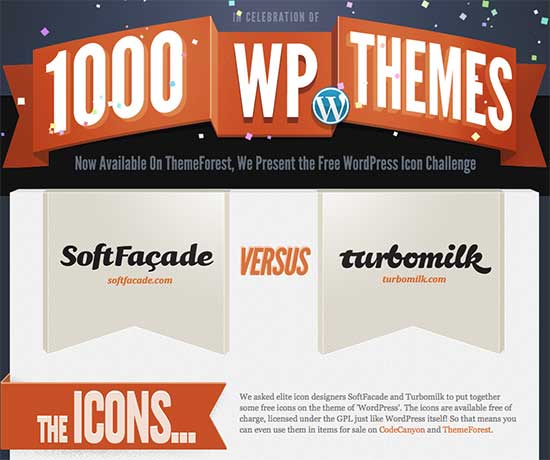
You can find websites with with ribbon and banner designs used in a variety of ways. You’ll find them big and bold for making proud announcements and showing achievements, as shown at the Theme Forest site below.
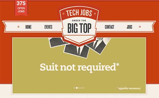
You can also find them as the graphic background for navigation, where they blend in with the overall design, as in the example below from the job site, Big Top IT.
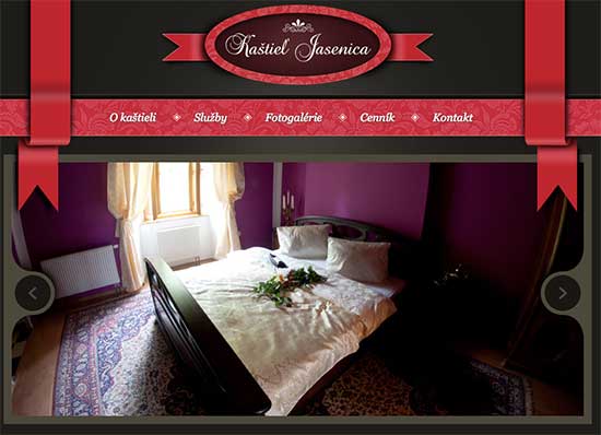
Although graphical ornaments seem playful and whimsical, you’ll also find them in an elegant setting as in the site shown below.
Lots of Variety
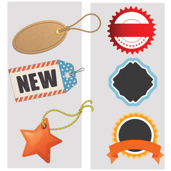
There is no shortage of these inexpensive elements for purchase at stock photo sites. They come in diverse colors, textures and styles. See below for some of the visual range available: 3-D, rippling like fabric and bordered with stitching. Ribbons also come with different orientations, such as horizontal, vertical, diagonal and curved.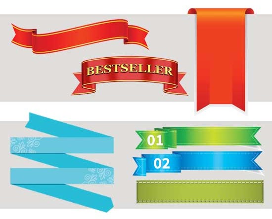 You will find a similar range of choices in tags and stickers, which replicate sales tags that hang from items in stores or serve as labels. See below for these. If they come with words you don’t want, you will need to remove them with a graphics program.
How to Use Ornaments
Visual ornaments stand out from the background because they are separate objects with their own border, shape, texture, color and often a shadow. You can use contrast to make them pop out as much as your need requires. For example, a large bright red ribbon will be prominent on a white background. A narrow light gray ribbon provides a subdued look on a white background.
Use for Design Impact
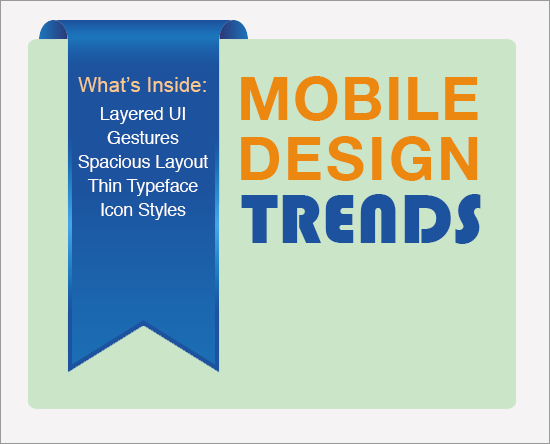
Ribbons, stickers and tags draw the viewer’s attention because of their contrast and novelty. If a design seems a bit monotonous, a ribbon for titles or navigation might add the punch you are seeking. The example below shows one way to use a vertical banner on a title graphic. It is a placeholder for the course contents and at the same time, provides impact more so than a plain list would do. Although ribbons may add a whimsical feel, they can also be elegant and sophisticated, depending on their color, texture and use.
Use for Emphasis
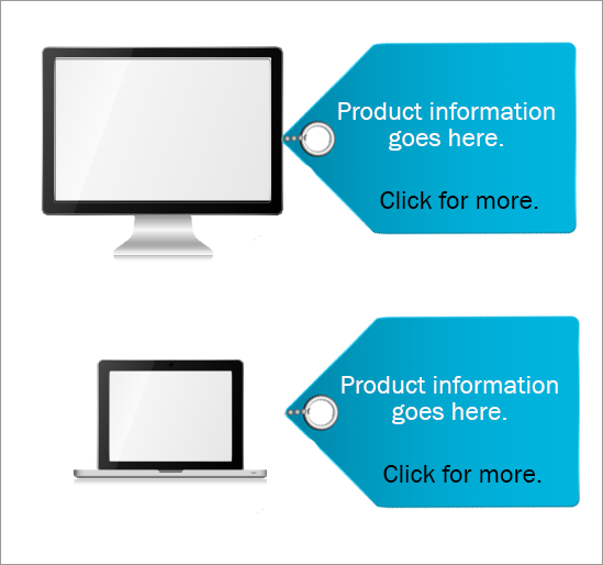
Tags and stickers are effective at focusing the user’s attention. Hang a tag off of an object to show it’s name or category. Or place important information in a sticker to ensure it is noticed. You can also turn them into clickable hyperlinks. In the example below, labels are used on product information to support a call center or a sales force.
Use for Extra Information
At times you may have one small little point that you need to make that doesn’t fit well anywhere else. Perhaps it’s just the number of a scenario or exercise in a sequence. Or it could be some new information that might get buried elsewhere. In these cases, place the text on a ribbon or a sticker and place it in a location that creates balance in your design.
See the example below for one idea. It shows the use of a caution ribbon in the upper left corner to separate each point in a course that covers five technology security risks for personal health information. This ribbon also conveys meaning because it replicates the caution ribbons used in the physical world. Thanks to David Anderson, from Articulate, for his suggestion to improve this graphic.

Cut out person courtesy of eLearning Art
Caveats
You can probably imagine a screen that uses too many ornaments or a course that uses them too frequently. Any element that adds impact has the potential for adding clutter. Use ribbons, stickers and tags for a real design purpose and select or create a style that aligns with the content and the audience. Design with intention.
If you like what you’ve read, check out my book that teaches visual design to learning professionals, covering principles and creative inspiration.
Get the latest articles, resources and freebies once a month
plus a Visual Design Cheat Sheet.

I like visual appeal as much as the next person. However, as Dorian Peters points out, designers need to be extra careful with ornaments and visual caffeine. Many times: less means more learning.
Oh I don’t know if it’s better… Just caught my attention which was your intention. Cool idea for using those types of elements.
Hi David,
Maybe your idea is better. I didn’t think of it! I guess I didn’t think of the ribbon as an “award” as much as something that would capture attention. Thanks for the great input. When I get a chance, I’m going to try your idea out in the example and see how it looks. 🙂
Connie
Some fun ideas here, Connie. Can you share why you went with an award ribbon over a yield or warning element for “risks” in the last example?