
The user interface is that nebulous space where humans interact with a device or machine. This space can be frustrating to users because it’s easy to get lost or because the system doesn’t work as expected. That’s why designing the eLearning user interface is a valuable skill.
We can make sure our audiences have smooth interactions with eLearning, mobile learning and performance support tools. Friendly user interface design is an essential part of designing learning experiences. It can influence a user’s perception of an entire learning event. So here is a look at user interface design from the audience’s perspective.
1. I don’t want to think about the user interface.
Design the eLearning user interface so that it is transparent to your audience. It shouldn’t be an obstacle or something learners have to decipher. If everything is clean and clear and works as expected, then learners can get on with the task of learning and not waste cognitive resources thinking about how to interact.
As Jakob Neilson, usability expert states,
“Users don’t care about design for its own sake; they just want to get things done and get out. Normal people don’t love sitting at their computers. They’d rather watch football, walk the dog—just about anything else. Using a computer probably rates above taking out the trash, though.”
2. I always want to know what to do next.
At one time, the rule of thumb was to include instructions on every screen. Experienced users may no longer need this if the options are obvious, though stating the instructions once or twice at the start covers people who are new to eLearning. If the design is non-linear and exploratory, let the audience know what problem they need to solve. Let them know they should be exploring. Whatever it is, your audience should not sit and wonder what to do next.
It’s surprisingly difficult to write concise and clear screen instructions for the eLearning user interface that all learners will understand. You’ll most likely require several revisions. Run your instructions by sample audience members or co-workers to see if they understand. Also, see these tips for writing microcopy.
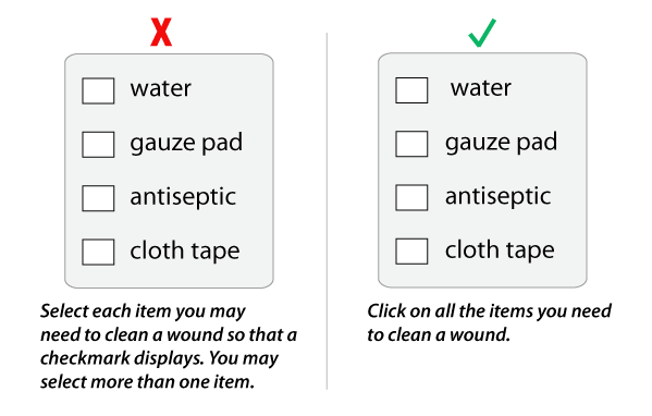
In the example below, the instructions on the left are unnecessarily long (and exaggerated to make a point). The shorter instructions on the right are sufficient and avoid potential confusion about what action to take.
3. I want the program to act like I think it should.
Everyone who is familiar with computer applications holds a mental model of how different types of software work. In eLearning, we can get quite creative using metaphors and themes. Whether your course uses a metaphor or a generic approach, follow logical and obvious conventions. Think about how audience members will expect the system to work and then make sure it does.
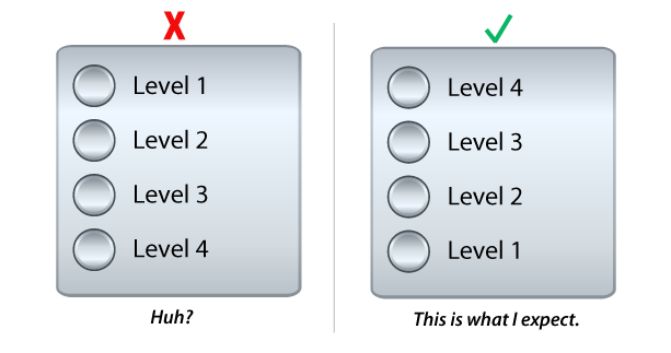
In the example below, the user interface is an elevator panel. Learners choose a floor on the panel, ride up to the selected floor and partake in learning activities on each floor. As they climb higher in the building, the activities become more advanced.
The elevator panel on the left doesn’t correspond to a typical mental model of how an elevator works. When the user realizes that going up to a higher level lesson is represented as going down the elevator, it’s confusing. When we stick to the metaphor, as shown in the example on the right, we’re modeling the way most people think.
4. I don’t want to wonder what an icon means.
When using icons for menu options and buttons, UI experts recommend supporting the icons with text. In fact, people often don’t recognize or locate the hamburger menu (three horizontal lines) on mobile apps. Because there is no standard icon set in the world of eLearning, our audiences have seen numerous and diverse icons that could mean, menu, lesson, resources, documents or glossary.
You can easily speed up the recognition process by adding text beneath the icon. If there is no room for text (and this is hard to believe), then display the label with a hover action—but this is not as helpful.
In the example below, the icon on the left could stand for a number of things. By adding text to the icon, as shown on the right, we help the user quickly identify the icon’s purpose and reduce unnecessary mental processing.

5. I want to know where to click, drag or tap.
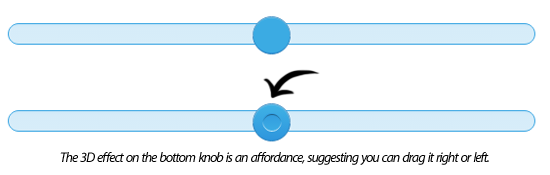
Your UI can support users by providing affordances. In his book, The Design of Everyday Things, Donald Norman defined perceived affordances as the properties of an object that give users clues as to how to perform an action using the object.
The common example is that a handle on a cup is an affordance that suggests how to hold the cup. In user interface design, a slight shadow behind a button or a thick line around a flat button suggests it is an object to be pressed. A three-dimensional design on a slider knob suggests the user can drag it to the right or left. The goal is to make your user interface as obvious as possible.
Note: Sliders are difficult to use and imprecise, particularly in a mobile interface. The Neilson Norman Group has some helpful recommendations regarding sliders.
These are five of many problems users might have with eLearning courses. What have you observed? Answer in Comments below.
Hi Katie,
I don’t know if there is one correct way to say these things. “Press” might be most appropriate for a mobile phone or digital tablet and click for a mousepad. The best advice is to try it out on your audience and see what is most clear to them. A great question!
Best,
Connie
This is extremely useful information! I am new to designing and recently began designing English Language Arts for grades 4 and 5. The biggest struggle in the beginning was my wordiness with instructions as you demonstrated in #2. I found that I was over-complicating the instructions when I could find a simpler way to explain a task. It
I did notice you use the word “click.” My editors prefer we use “press.” For example, “Press the hotspots to learn more about verbs.” Thoughts or preferences on the difference between using “click” or “press”?
Thank you for such an insightful and informative article that has given me new perspectives!
This is great and useful blog which teach us about computer user interface design. Thanks for sharing good post. Awesome!!!
Darren,
That is an excellent question and now I will put that on my list of topics to discuss. User interface design for people with impairments is a huge and important issue. We know it as 508 Compliance and it is a mandatory requirement for many government and institutional technology products. There are certain obvious UI enhancements you can make, such as ensuring the audio script is accessible as text by clicking a button (for the hearing impaired) and by using voice-overs to present content (for the visually impaired). I know that Articulate Presenter comes with a “Notes” button which I change to “Transcript.” Of course, this is just the tip of the iceburg. Hopefully, the resources below will help you.
Please see if the resources on this page help: 508 RESOURCES.
Also, there is 508 Universe Training.
Very Interesting article.
Do you have any E-learning course examples that display the use of W3C conformations for the disabled?
I am looking for some courses that display the use of aids for the near sighted and hard of hearing.
Very difficult to find.
cheers
I added examples!
Useful and interesting! A few examples would’ve made it great!